Friday, 19 December 2014
Narrative Structure
After discussing my storyboard with my teacher, we felt it was appropriate to experiment with different narrative structures and the possibilities of rearranging certain shots/scenes and the impact it would have on the narrative. Therefore, I have decided to rearrange my storyboard numerous times to gauge exactly how it will effect the perception of my music video. This is relevant to Todorov's narrative theory. The narrative will be though provoking, it will present the struggles of a young girl (around the age of 8-9). I will also be analysing some popular narrative videos to help me collate research and further understand the importance of narrative structure taking into account Todorov's theory.
Monday, 8 December 2014
Costumes/Props
In order to create a sense of verisimilitude in my production I have had to organise some costumes/props to make the video as a whole seem more believable. Therein, as I have chosen my younger sister to star in the production. I have been researching music video extensively, and, as Pete Fraser alludes to in "Teaching Music Video", the Mise en Scene is of much importance as it is "the combined effect of a series of visual elements within the frame of a visual text, such as costume, props, decor, figure placement."
Therein, in order to further help me and be more incisive in creating the production, I have photographed the costume that will be worn by my younger sister with a photo of a prop that I will use in my video. This planning will allow me to be more concrete in the actual production of the video and so by collating my thoughts now it will allow me to foresee how it will pan out.
 This is the coat that will be worn by my younger sister who is nine, I intend her to wear it fully zipped up with the hood up to connote a lack of identity and insignificance - just like the girl who wore a large jacket and a hooded top in the A Team which created the effect of her seeming inferior physically and conceptually. Luckily the colour of the jacket is quite dull which will work well in conjunction with video effects on Premiere Pro such as black and white and colour correct (which isn't technically an effect but it may still have to be altered). The fur hood will go far in obscuring her face in some of the video and creating ambiguity. The coat also denotes that the weather outside is pretty unpleasant which does well in creating the effect of pathetic fallacy, essentially echoing the emotions of the girl wearing the coat who needs to be made to look smaller and more vulnerable - this parka style jacket does exactly that. I knew as soon as I was using a young actor that I would need them to wear a coat of this sort of style, it would be useless if she was wearing a fluorescent cardigan in the sunshine, the narrative/visuals need to go some way in matching the audio/lyrics.

Depicted above - a mid shot from Ed Sheeran's "The A Team" with the girl sporting hooded jumper and large coat with the hood up - this denotes that she is obscured from society and also that he is generally trying to keep warm in cold weather and is suffering from a lack of shelter.
 Another photo of the coat from the front.

During the inaugural scenes of the video, the girl will be reading a note she has found in her school bag, and so in order to match this and bring an essence of verisimilitude to the text she will be wearing school uniform attire to connote a sense of realism. The cardigan is a maroon/burgundy shade and quite an autumn like colour, it is not too bright and so it will not look ridiculous when black and white effects are applied to the piece, it also bears her school's logo/badge on the left side of the chest which clearly shows that it is a school/educational institution of some sort and not a fashionable piece of attire - this also goes a long way in establishing that she is very young and is not even in secondary school yet. This does well in embodying the lyrics of my chosen song: "the youth you've strangled in us it brings me to disgust". This is also why it is a good idea to ensure it is made clear through the Mise en Scene that she is very young, because it can help me reinforce Andrew Goodwin's theory of music videos - the visuals should match some of the lyrical content in the song. A good coincidence is that this cardigan is actually slightly too big for my sister, which will only make her appear more diminutive especially when filming her encompassed by large fields and in long distance shots.
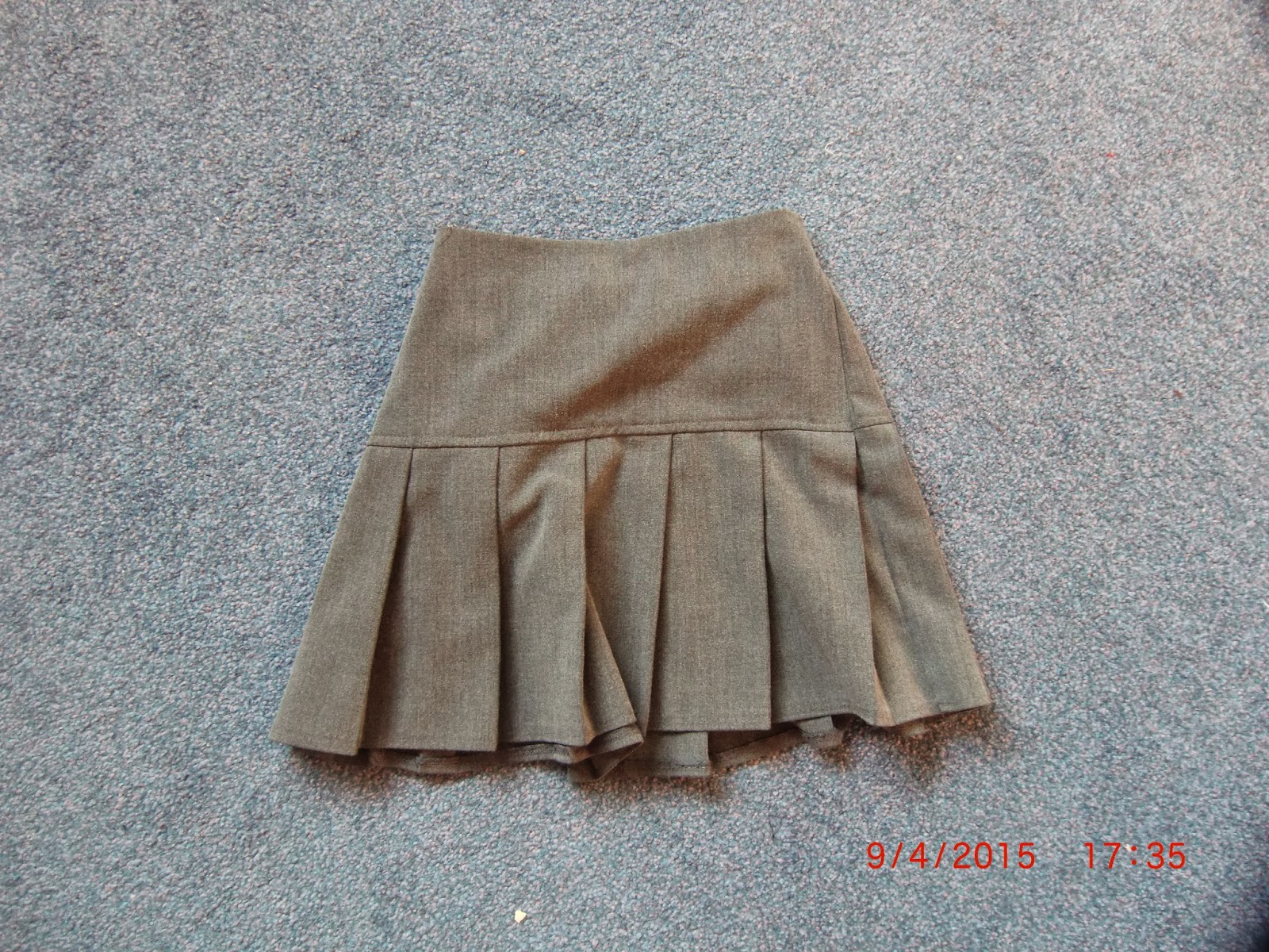
This is another component of my sister's school uniform which I felt was important in continuity and verisimilitude - there would be no point in having her wear her school cardigan and coat if she was wearing jeans or jogging bottoms, it would lose the text credibility and people would most likely become confused by the mise en scene which would impact my production negatively. My actor will be wearing black tights underneath the skirt just to further reinforce the idea of youth to construct meaning and evoke a sense of empathy from the audience. It also connotes innocence and youth, the fact they are grey makes the whole outfit look more dull and miserable - which reflects the way in which the actor will be behaving in the video.

My video will feature this large teddybear at one point or another, I intend to have my actor clutch onto this in a moment of extreme depression (excessive crying) in order to build further meaning by creating another binary opposition - I like the idea of a young girl, who should really be carefree and enjoying the best years of her life, being depressed and clutching onto a teddybear - something that signifies youth, joy and compassion. However, this is not the case, the girl will be clutching onto the teddybear in desperation and in utter sadness (she has read a note containing an abusive message - I am unsure whether I will disclose the message on the note or not yet) and so she has been psychologically damaged by this. In addition to this, the teddybear is white, which in semiotics connotes a youthfulness, a purity and an innocence which is why it will be so effective in helping create a binary opposite. In addition to this, again, the teddybear is very large which will help create the illusion that my sister is incredibly small (which she is) but this will go some way in making her look even more vulnerable.
The residual effect of this prop is that it will elicit a sadness in the audience, therefore evoking a sense of empathy from them as they will be feeling what the protagonist is feeling.
Therein, in order to further help me and be more incisive in creating the production, I have photographed the costume that will be worn by my younger sister with a photo of a prop that I will use in my video. This planning will allow me to be more concrete in the actual production of the video and so by collating my thoughts now it will allow me to foresee how it will pan out.
Depicted above - a mid shot from Ed Sheeran's "The A Team" with the girl sporting hooded jumper and large coat with the hood up - this denotes that she is obscured from society and also that he is generally trying to keep warm in cold weather and is suffering from a lack of shelter.
During the inaugural scenes of the video, the girl will be reading a note she has found in her school bag, and so in order to match this and bring an essence of verisimilitude to the text she will be wearing school uniform attire to connote a sense of realism. The cardigan is a maroon/burgundy shade and quite an autumn like colour, it is not too bright and so it will not look ridiculous when black and white effects are applied to the piece, it also bears her school's logo/badge on the left side of the chest which clearly shows that it is a school/educational institution of some sort and not a fashionable piece of attire - this also goes a long way in establishing that she is very young and is not even in secondary school yet. This does well in embodying the lyrics of my chosen song: "the youth you've strangled in us it brings me to disgust". This is also why it is a good idea to ensure it is made clear through the Mise en Scene that she is very young, because it can help me reinforce Andrew Goodwin's theory of music videos - the visuals should match some of the lyrical content in the song. A good coincidence is that this cardigan is actually slightly too big for my sister, which will only make her appear more diminutive especially when filming her encompassed by large fields and in long distance shots.
This is another component of my sister's school uniform which I felt was important in continuity and verisimilitude - there would be no point in having her wear her school cardigan and coat if she was wearing jeans or jogging bottoms, it would lose the text credibility and people would most likely become confused by the mise en scene which would impact my production negatively. My actor will be wearing black tights underneath the skirt just to further reinforce the idea of youth to construct meaning and evoke a sense of empathy from the audience. It also connotes innocence and youth, the fact they are grey makes the whole outfit look more dull and miserable - which reflects the way in which the actor will be behaving in the video.
My video will feature this large teddybear at one point or another, I intend to have my actor clutch onto this in a moment of extreme depression (excessive crying) in order to build further meaning by creating another binary opposition - I like the idea of a young girl, who should really be carefree and enjoying the best years of her life, being depressed and clutching onto a teddybear - something that signifies youth, joy and compassion. However, this is not the case, the girl will be clutching onto the teddybear in desperation and in utter sadness (she has read a note containing an abusive message - I am unsure whether I will disclose the message on the note or not yet) and so she has been psychologically damaged by this. In addition to this, the teddybear is white, which in semiotics connotes a youthfulness, a purity and an innocence which is why it will be so effective in helping create a binary opposite. In addition to this, again, the teddybear is very large which will help create the illusion that my sister is incredibly small (which she is) but this will go some way in making her look even more vulnerable.
The residual effect of this prop is that it will elicit a sadness in the audience, therefore evoking a sense of empathy from them as they will be feeling what the protagonist is feeling.
Friday, 5 December 2014
Digipak Analysis: Lil Wayne - "Rebirth"

Rebirth does not use monochrome features like those that are seen on an array of indie albums (Artic Monkeys, The Kooks etc.). However, the difference in genre is one of the key reasons that the mise en scene and colour scheme on Lil Wayne's album manifest significant differences: he is trying to appeal to a completely different audience/demographic. The album cover poses some form of juxtaposition: rap music is renowned for utilising materials such as 'synth' sounds using computer programmes such as logik, fruitloops and maybe even cock garage band depending on the stature of the artist, however, Wayne poses with a guitar placed across his lap - this causes us to question why he would have a guitar on his person as a rap artist whos songs use no guitars whatsoever. This could essentially be considered somewhat of a binary opposition - rappers who maintain a very macho image and remain loyal to hip hop (almost hip hop/rap 'purists') and guitars that are usually considered 'rock n roll' or 'indie' do not go hand in hand, which is what makes this a very intriguing digipak cover.
As it can be expected a bold and very modern typography is used and centralized within the confines of the frame, this is a commonality I have noticed on an array of different digipaks. The colour of the typography (which features no serifs due to it's more modern look) contrasts the colour of the background image. This is important in catching the eye of potential consumers so that they are immediately aware who the artist is (also due to the image on the anterior of the digipak).
The gold colours used in the image are clear connotations of high status and wealth, which are the exact words that hip hop artists want associated with them. It is also clear that the lethargic position the artist is laying in suggests a certain nonchalance about his personality, as if he is of a high status but almost 'isn't bothered' about it as if to say that being successful is easy. The artist himself is also centralised, and when taking into account the rule of thirds in the mise en scene, this denotes that he is important and the pinnacle of the album - as it is his album. In addition to this, the artist is wearing a white t shirt - white, the colour that represents purity is an interesting choice of colour, and it only adds to the artists lavish look.
Saturday, 22 November 2014
Storyboard: "The Fight"
Enclosed is my storyboard which I will refer to when filming and also creating my animatic. The artwork itself is incredibly lax, however, this gives me a reference point to work with when going out and filming my video so that I can have a solid foundation to work from. It will help me decipher what shots I will use in my project and also provide some help when working out timings and transitions in the video. Depicted below are my final storyboards complete with annotations which give me a solid reference point to work from when filming.


Tuesday, 18 November 2014
Initial Shot List/Script
I have decided that in order to help the execution of filming be more concrete and incisive (so that I can go and film as soon as my ancillary texts are completed and I have all my other required materials such as storyboard, animatic etc.) I should produce a provisional shot list to give me a good idea of how the video will be shot and to take a more pragmatic approach to making the film.
It is important to note that this is merely a provisional shot list and that these shots/timings are at the moment a guideline and are subject to change in the future, whilst my animatic may also differ should I choose to change the narrative structure of my product.
Below is a synopsis of the scene/shot and the duration of time it will feature for.
My shot list will be as follows:
ECU of eyes moving laterally in conjunction with slow opening guitar riff 00:10 - 00:15
Shot of title screen featuring band name and title of the song along with "directed, edited and produced by Joe Grogan" 00:15 - 00:20
ECU revert back to original ECU of girls eyes moving laterally 00:20 - 00:25
Mid Shot/Possibly Establishing Shot of house girl is in kitchen reading note containing abuse 00:25 - 00:34
Close Up to focus more clearly on the girls face to reflect her emotions and how she is feeling 00:34 - 00:39
ECU of girl's eyes moving laterally to denote she is reading the letter 00:39 - 00:45
Mid Shot of girl in lobby putting her coat on 00:45 - 00:52
Intercut to mid shot of girl crying and clutching teddybear whilst sitting on bed 00:52 - 00:54
Back to mid shot (high angle shot to connote inferiority) of girl putting her coat on (from behind to emphasise her insignificance) 00:54 - 00:58
Mid shot of girl reaching for door handle 00:58 - 01:01
Match on Action to maintain continuity
Cut to ECU of girl's hand on the door handle, her opening the door and proceeding to leave the house and shut the door 01:01 - 01:08
Long Shot of girl walking away from house and then a cut to her walking past (away from camera) 01:08 - 01:19
POV Shot of girls feet that denotes she is looking at the floor (emphasising that she is emotionally hurt - melancholy) 01:19 - 01:24
Close Up Tracking Shot of girls face whilst walking through cul de sac - capturing facial expression 01:24 - 01:28
Mid/Long Shot of girl walking past camera 01:28 - 01:32
Close Up/Canted Angle - girl unearths an alleyway she has not seen before - looks past the camera 01:32 - 01:35
POV Shot of alleyway from the girls point of view - evokes empathy from the audience 01:35 - 01:39
High angle shot of girl walking past camera through the alleyway (slow motion for dramatic effect) 01:39 - 01:42
Cutaway to high angle close up of girl staring vacantly by a telephone post whilst music stops this creates a sudden change in tempo and allows the visuals to work in conjunction with the music 01:42 - 01:46
High Angle Mid Shot of girl looking curiously into what lays at the end of the alleyway (which she is already standing in) and edging closer into the alleyway past the camera 01:46 - 01:50
POV Shot of field 01:50 - 01:57
Cut to Mid Shot of girl who is mesmerised by the open field she finds herself encompassed in 01:57 - 02:01
Cutaway to girl crying clutching oversized teddybear in a mid shot and then cut back to Mid Shot of girl in the field smiling whilst removing her hood 02:01 - 02:08
Girl experiencing happy cathartic release by running in the field (whilst intercutting footage of close up of the girl sitting in her room ripping up the note angrily and bursting into tears). The shot of the girl running will be a mid shot that documents her incrementally moving further and further away from the camera until it eventually becomes a long shot with the omission of a tracking shot which connotes insignificance and neglect 02:08 - 02:15
Cut to black screen 2:08 - 02:12
Wide shot of field with time lapse effect on Premiere (adjusting speed/duration setting to speed up footage) 02:12 - 02:16
Cut to black screen 02:16 - 02:20 - these cuts to black are to connote a lapse in time in conjunction with the time lapse itself, if these fail to achieve the desired effect then I will make adjustments and may omit them altogether if they break the continuity of my production.
Long Shot of girl in very open field walking towards camera, staring vacantly but also looking melancholy, she will walk slowly towards the camera until it is more of a mid shot, intercuts of the girls hands in a mid shot/close up tearing up the note will be apparent but this must happen in time with the beat of the drum, this will create a sense of foreboding so that the visuals match the audio 02:20 - 02:30
Eventually this will culminate in the chorus where guitars are amplified and feature more distortion, which the vocalist screams "I've got to run away!!" which is why I will adhere to Goodwin's thesis and add a clip of the girl in a long/mid shot running from behind the camera (so that the visuals match the lyrics) with a slow motion effect, despite the fact this is where the song culminates a slow motion effect would actually work incredibly well to create dramatic effect.
I will then intercut this with footage of the girl throwing the ripped note around in a mid shot, probably tipping it out of a bin before tossing the bin (still using a mid shot to capture her body language) and retreating to her bed to hold the teddybear and cry - this is another binary opposition of her being happy/sad. I also intend to have cutaways of the girl on playground rides such as swings and possibly rocking horses looking pensive and upset in mid shots to establish that she is on a swing, before using close ups to capture facial expressions/emotions, creating another opposition between the rides which we usually associate with joy and innocence (children on rides are usually enjoying the best years of their life) and the girl who is clearly very depressed and carrying emotional baggage. 02:30 - 02:50
After this I intend to use footage of the note that has been sellotaped back together: with a close up of the girls face (intercut with the ECU of the eyes moving laterally) re-reading the note and then cutting back to the close up to capture her giving a brief smirk - she will then place the note on the table and run off - at this point I intend to blur the background (whilst she runs away) but keep the note on the table in focus. I will then cut to a close up of the note which can be read saying "YOUR NOT MY FRIEND I HATE YOU NA NA NA NA NA!!!!!" or something very similar - this will probably disturb the audience to see a girl so young psychologically tortured and will shock the audience. I then intend to use footage of the girl running away again whilst intercutting this with slow motion clips of her genuinely smiling and enjoying herself in either the playground or another location in which she was previously featured looking miserable. A mid shot will be used so that she does not look as insignificant and a close up will elaborate on her facial expression and capture her happy expression.
I am undecided as to whether I will feature a black screen with text saying "The End" or whether just to fade the video to black. 02:50 - 03:37
Saturday, 15 November 2014
Mock Up Plan
Over the rest of the academic year I intend to complete a number of tasks in order to ensure that I have a more vivid idea of what I want to create, this will involve planning and researching pre-existing texts similar of that that I intend to emulate - some of my research has been conducted on an eclectic range of music, however, I now hope to focus on collating research and mock ups of ideas that relate more to the style of music I will be producing for (Indie Rock/Rock). The tasks will be as follows:
Ideas for digipak inspiration
Ideas for magazine advert/poster inspiration
Initial ideas and perceptions - Spider diagrams
First draft of digipak
First draft of magazine advert/poster
Analysis of 4 magazine adverts
Analysis of album covers/digipaks of a similar genre to mine (at least 4)
Initial script of video
Shot list
Shooting schedule
Codes and conventions of rock/indie rock music videos
Conventions of music videos that feature children
Produce a list of equipment/resources I will need
Rough storyboard
Actors
Locations
Props
Produce an animatic with feedback
Final designs for digipak and magazine advert/poster
Hopefully I should have all of this completed near the end of term which would allow me to commence with the filming of my video and also post-production, all of these will have been inspired/informed by my research which will allow me to gain even more of an idea into the codes and conventions of my music video and how it will pan out.
Initial Ideas and Perceptions
Due to the name of the song - "The Fight" - My initial thoughts were to create a video featuring an array of martial arts sequences to embody the metaphor of the song, however, due to practicalities I decided to take a more pragmatic approach and use some actors
Ideas
Combat montage: I thought that in order to body the metaphor of the song, I could use some martial art/combat specialists to emphasize the frustration of the singer, I would preferably use a martial arts specialist or a boxer, this would adhere to the songs message and convey the struggles of the protagonist. One of the most recent examples of a music video like this would be Maroon 5 - One More Night in which lead singer Adam Levine is shown in a number of shots training intensely in a boxing gym for a number of scenes/shots until the video culminates in a big fight. This video serves as a useful reference point on which to base some of my ideas should I choose to use this idea. This idea would have to involve a series of close - ups and extreme close ups to capture the emotions of the protagonist. In addition to this, the most intense scenes should be used as the song is in the chorus, as this is when the song is at it's loudest. If I were to apply this idea to my video, the fight scene would have to happen towards the end of the video to keep the audience in suspense. During the fight, a shot reverse shot must be used (whilst adhering to the 180 degree rule) to convey to the audience that the two parties are very much against each other, however, when the protagonist and coach are training together they must be presented through the use of a two shot to connote unity. The environment in which this video is set is of paramount importance: it would require a boxing gym to stage training sessions and give the video a sense of verisimilitude, therefore having more of an effect on the audience as the text will have more cinematic credibility.
Performance video: I would also like to explore the idea of having a performance video for the band, as my research has informed me that many bands similar to the band I am creating for have taken this approach to music videos. For example, Guns N' Roses have made two very successful performance videos with hits "Sweet Child O' Mine" and "Paradise City". One commonality among these videos is the use of monochrome effects that connote a very vintage and minimalist approach to music and reflect the artist's musical ideologies. Also, a band performing in a video for which they have quite a lot of creative freedom reinforces the minimalist approach to music, as it shows them doing what they have done for there entire career - performing their songs for the fans - with the omission of any drastic special effects. This video would require the use of some wide shots to represent the band as a cohesive whole, before using close-ups/extreme close-ups on each member of the band individually, placing special emphasis on certain members of the band depending on the juncture of the song i.e. if there is a guitar solo, emphasis will be placed on the guitarist. I have also contemplated the idea of using a number of extras to pose as fans, however, I felt this would be too difficult as it would be incredibly difficult to organise such a plethora of actors and it could also incur unnecessary costs for actors/extras who are not needed.
Development from adolescence ( narrative video): Whilst the song encapsulates many of the negatives elements of an intimate relationship, it also describes how relationships can elicit immaturity but also become mundane, hence the line "Our youth you've strangled from us has brought me to this state" - commenting on how love can constrict our personalities. Therein, I plan to construct a video that revolves around younger actors in order to get an idea across - the idea that our behaviour in relationships does not differ much regardless of our age, that we manifest similar characteristics whether in the midst of a silly playground romance or a long-term relationship. This is why I may use younger actors, is it almost simplifies the problems we face in loving relationships. This will use a series of shot-reverse-shots to emphasise the burgeoning animosity between the two, rather than presenting them in a two-shot, which would connote that they are together and there is no discord between them. As per usual, it will also have to include an array of close-ups/extreme close-ups to capture the expressions of the actors in order for the audience to empathize. I believe the binary opposition between young and old and love and hate really encapsulates the meaning of the song.
Wednesday, 5 November 2014
Research: Music Video/Target Audience Survey
Please take my survey on music videos, all responses will be appreciated.
https://docs.google.com/forms/d/1_CJcF10gpFOLH0K_JnM14f_Gc5x3pNik3LDcSee_Szk/viewform
https://docs.google.com/forms/d/1_CJcF10gpFOLH0K_JnM14f_Gc5x3pNik3LDcSee_Szk/viewform
Monday, 3 November 2014
Digipak Analysis: 50 Cent - "The Massacre"
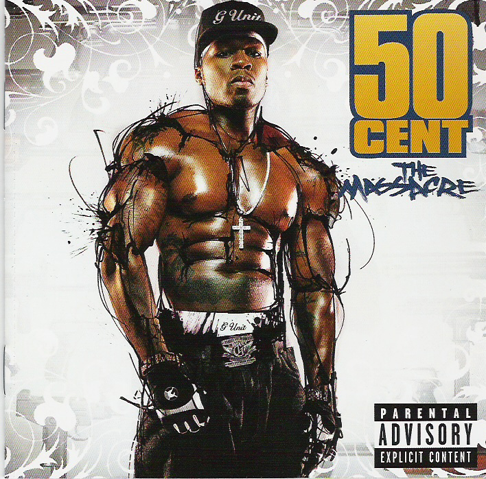
50 Cent's The Massacre digipak has been designed/formulated to boost his street credibility, reputation and sex appeal. The artist is surrounded in what appears to be an ink of some sort, although it could be something else. This 'ink' further accentuates his muscular physique, creating more striations across his body to make him seem more intimidating to other men whilst also painting him as more sexually provocative and appealing to the opposite sex. The attire he is wearing (shirtless with gloves) connote he is aggressive - the gloves look similar to those that would be used for fighting in fight clubs (MMA). However, the presence of the christian cross he bears around his neck means that the image is somewhat of a binary opposition: he looks rough, masculine and ready to fight, however, the christian cross is a symbol of peace and love, which completely subverts the message he is trying to get across through his fighting attire. Although, the cross itself appears very lavish which denotes that he is wealthy, again boosting his reputation and self image. He is completely centralized and takes up a huge proportion of the frame to ensure he is the first thing the consumer sees when picking up/looking at the album; adjacent to him is his name in large gold typography, ensuring that it can be spotted easily and that it is unmistakable.Gold is considered expensive and luxurious, which relates back to the necklace and how 50 Cent is seeking to promote his self image as a positive and wealthy 'alpha male', it also menas the text contrasts nicely against the white background and is not difficult to decipher. Another intriguing aspect about the album cover is that the title (located underneath the bold typography "50 CENT") "The Massacre" is styalized in a way the relates to the word 'massacre' which is essentially a brutal and messy slaughter of a vast number of people. It is not a coincidence that the title has been written in a way that looks as though it has been 'scratched' into the album with a sharp implement, in (apart from the text's blue colouring) what could otherwise be described as blood. I think the message the artist is trying to convey is that after being one of the most acclaimed rappers in recent time, he has essentially 'massacred' all other artists - the album title is an extended metaphor for how he has surpassed the acheivements of many of his rivals. [UNFINISHED TO BE CONTINUED]
Sunday, 2 November 2014
Digipak Analysis: Guns N' Roses - "Appetite For Destruction"

The digipack uses a black background, a dark colour that bears sinister connotations that is heavily related with rock music. It is a simple album cover featuring only the logo of the band, which has been used religeously since it was first used to promote the band. The fact that the band have chosen to use one image on the front of their album connotes that they are taking a minimalist approach to making music and remain focused exclusively on their craft. The logo itself (at the time of it's release) was branded as offensive, as it decorated the christian cross with skulls (some of which smoking cigarettes) which meant that the album - which was released in 1987 - had to be issued with a parental advisory sticker. The dark background in conjunction with the outrageous emblem paved the way for a number of other bands within the field of metal/hard rock (although Guns N' Roses themselves were probably influenced by punk bands who were rebellious and produced offensive album covers - for example The Sex Pistols' debut album "Never Mind the B*******"). Therein, offensive/controversial album covers have become a commonality among bands in the rock genre, bands that thrive on the notion of revolting, being rebellious and advocating an anti-establishment type attitude. Each of the skulls used embody a different member of the band: the skull situated at the bottom of the cross boasts lead guitarist Slash's trademark top hat, messy hair and a cigarette, whilst the hat worn by the skull stationed directly in the middle of the cross is typical of the band's lead singer Axl Rose - this denotes that the band are a brand, they have an identity and they are promoting their product by personalising it, making it recognisable to the fans who are able to empathize. In the same font typography, the album name is placed horizontally along the spine of the digipak to ensure it can be easily located on a CD rack. In terms of the dimensions/confines on the front of the album, the logo is centralized and takes up a massive proportion of the front panel, with no other decorations surrounding it. Essentially, this has been employed to ensure that the logo/name of the band sticks in the consumers mind and means the band are more marketable as a brand/product if they have a recognisable identity. The orange tint at the top of the logo allows the typography (the band's name) to be displayed clearly, as it contrasts perfectly against the jet black background. The logo in itself is a binary opposition: the christian cross symbolizes atonement, god's love and Jesus' victory despite death, however, due to the controversial adorning of the cross it now appears ostensible and somewhat negative, manifesting ideas that have nothing to do with christian religeon/culture - which therefore qualifies it as a binary opposition.
This digipak uses semiotics: the attire that adorns the skulls are quite clearly a trademark of Guns N' Roses' look e.g. the tophat is one of the main indices of Slash and is in fact in itself iconic, which is what makes this digipak so intriguing.
This digipak uses semiotics: the attire that adorns the skulls are quite clearly a trademark of Guns N' Roses' look e.g. the tophat is one of the main indices of Slash and is in fact in itself iconic, which is what makes this digipak so intriguing.
Saturday, 1 November 2014
Digipak Analysis: Arctic Monkeys - "Whatever People Say I Am, That's What I'm Not"
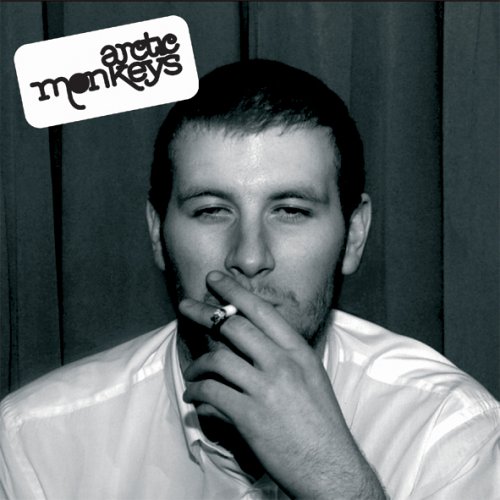
As with other digipaks I have analysed, this album - Arctic Monkeys' debut release Whatever People Say I Am, That's What I'm Not - follows some conventions relevant to it's own genre, a hybrid of garage rock and indie pop/rock. For instance, the black and white effect on the photo is distinctly similar to the colour scheme used by indie band The Kooks on their debut album Inside In Inside Out. The album cover is ostensibly simple, however, many techniques have been employed to create an image in the mind of potential consumers and provoke certain reactions. The first interesting point is the fact that the man on the front of the album isn't actually a member of the band, which will evoke curiosity from loyal fans who will question the relevance of the individual on the front of the album. The way in which the bands logo has been embossed on the top left hand corner of the album is also intriguing - it suggests a carefree/carelessness about the album, it looks as if it has been stamped on without being given a second thought. Not only that, but the fact that the man is smoking a cigarette (which has been made incredibly conspicuous) also connotes that the album is aimed at young people, who in the modern day media are painted as rebellious and angry youngsters that like to 'fight the system'. The fact remains, though, that the image of a man smoking appeals to a young demographic who indulge in the unhealthy infatuation of doing things they have been warned not to do. In addition to this, the man is clearly under the influence of some drug (presumably alcohol), which again young people can relate to, as this is a notion that the album thrives on: nearly every song on the album involves lyrics that encapsulate a typical night out for pretty much anyone under the age of 25, probably younger than that. This allows the consumer to empathize with the man who looks disorientated and incoherent, but this is what young people can relate to - they can see glimpses of themselves in the man's demeanor. The black and white effect on the photo denotes a sense of nostalgia and individuality, traits used by many other indie bands to give the album a retro image. The album cover appears with only one image, the bare minimum they could have placed on the front of the album - this connotes that the band are focused exclusively on making music rather than creating lavish album covers and an exorbitant image. This indie ethos appeals to the fans and adheres to their target demographic. The typography used in the logo is slightly more flamboyant than that on The Kooks' album, although this logo has been used ever since it's inauguration which connotes that the band set out to create a brand identity to make them recognisable to their fans and meaning that they can gain easy exposure through advertising etc.
Friday, 31 October 2014
Digipak Analysis: The Kooks - "Inside In Inside Out"
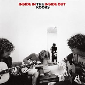
As it was outlined in my textual analysis of The 1975 -"Robbers" it is common for indie bands to experiment with more low key lighting to achieve a retro finish to their work, again, as is seen in promo's featuring The 1975 (a band who are similar in their indie appearance). All band members are pictured, the formation in which they are sat is particularly interesting - instead of having a picture of the band lined up side by side to fit all members in the frame comfortably, the band are photographed (what we presume) rehearsing, however, the angle at which the photo has been taken has been deliberately employed to maximize audience involvement. In essence, the album cover is designed to make us feel as if we are there with the band, in their presence, which evokes a sense of empathy from the consumer and outlines one of the main themes of the album: The Kooks are a band who formed at university and are ordinary people like those who will likely purchase the album, and the cover of the album supports this notion (the fact that it is their debut album suggests they have only experienced a small dose of fame - perhaps they were popular locally). The typography (which has become a commonality among indie bands) is made up of bold lettering to ensure the title of the album and the band name is unmistakable and embossed for consumer recognition. The album title Inside In Inside Out is given prominence by the striking rich red it is coloured in, only to be made more appealing by the relatively dull, light shade of grey in the backdrop. This makes the name of the album clear to the consumer and means the name will stick in the mind. The black and white effect used suggests nostalgic connotations and gives the album as a whole an anachronistic - essentially qualifying the artwork as 'postmodern': lead singer/songwriter Luke Pritchard cited 60's music as the primary influence on the album, and it is clear from the artwork that the design has made a return to more traditional materials and effects. The colour scheme and typography on the anterior of the album cover is used on all other panels of the digipak to keep it consistent. The album cover seems incredibly simple and it doesn't deliberately go for a particularly lavish appearance, and adheres to indie conventions of avoiding mainstream traits. As previously mentioned, The Kooks are aiming to target a demographic of young people in a similar position to themselves, possibly students with retro dress sense and passion for acoustic music. The fact each member of the band have averted their gaze from the camera connotes that they remain unfazed by media exposure and focus exclusively on making music, manifesting themselves as level headed. The photo of the band itself shows them sitting with each other making music without glamerous studios and recording equipment, a relatively simple environment; an area that could easily be described as a room in a university hall - which makes sense in the context of their target demographic and their social background. The mise en scene in the photo is also textbook indie: skinny (drainpipe) jeans and mop head hair; not too dissimilar to that of The Beatles, is an obvious denotation that the band remain loyal to the indie subculture.
Thursday, 30 October 2014
Digipak Analysis: Stone Roses - "The Stone Roses"
Digipak are the packaging used to market CDs and promote the album/artist. Many types of digipak have been designed in order to draw the attention of potential consumers - designs have usually been designed and refined through extensive market research that targets what the demographic buying the CD find interesting. Digipaks usually comprise of a gatefold or 'book-style' paperboard outer binding and plastic trays capable of holding a CD or even a DVD. Digipaks have become popular as they are far less abrasive than the old style record cases which used to biodegrade more easily.
The Stone Roses: Stone Roses
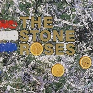
This album boasts incredibly abstract features that are appealing and easy on the eye. The art is actually a product of John Squire's (Stone Roses lead guitarist) painting, the abstract backdrop in conjunction with the bold gold typography embosses the bands name to ensure it is clear and visible. Squire's piece has been heavily influenced by Jackson Pollock's artwork - a painter who was pivotal in the abstract expressionist movement - essentially it connotes that the band are not looking to represent external reality, but they are manifesting subliminal messages through abstract work that can be interpreted in a number of different ways - by fans buying the album, they are giving their artwork their own meaning. The French flag on the far left side of the album pays homage to the May 1968 riots in Paris, where the use of lemons where found to be a viable antidote to tear gas. The fact that the band would choose to reference such an event to support the release of the album is in itself a demonstration of the bands contribution to the rock/indie subculture: the majority of bands were still fixated on covers boasting self-portraits of the band/artist posing in dignity or photos of the band in peculiar situations. At first glance, the albums backdrop can easily be mistaken for an image of a map or a birds eye photograph of a western european country, which makes sense considering the ideologies and inspirations for the album. The typography is specifically designed to attract attention, it is a no-nonsense bold lettering makes the band's name (essentially their brand/identity) unmistakable. Not only is the typography appropriate, but the use of gold lettering contrasts the background well - making the text stand out - but gold is also an incredibly prestigious that connotes wisdom, magic and passion, whilst the metal gold is an incredibly lavish commodity.
The abstract nature of the painting compels the consumer, forcing them to further analyse and ponder the albums imagery. The cover is thought provoking, which encourages the consumer to pick the album up and contemplate buying it without even giving thought to what is undisputably the feature of most importance in an album - the music. The album highlights just how important an identity is to a band, and also the significance an album cover bears on how many copies it sells, an album cover design should not be underestimated as it is one of the single most efficient methods of marketing the product.
The Stone Roses: Stone Roses
This album boasts incredibly abstract features that are appealing and easy on the eye. The art is actually a product of John Squire's (Stone Roses lead guitarist) painting, the abstract backdrop in conjunction with the bold gold typography embosses the bands name to ensure it is clear and visible. Squire's piece has been heavily influenced by Jackson Pollock's artwork - a painter who was pivotal in the abstract expressionist movement - essentially it connotes that the band are not looking to represent external reality, but they are manifesting subliminal messages through abstract work that can be interpreted in a number of different ways - by fans buying the album, they are giving their artwork their own meaning. The French flag on the far left side of the album pays homage to the May 1968 riots in Paris, where the use of lemons where found to be a viable antidote to tear gas. The fact that the band would choose to reference such an event to support the release of the album is in itself a demonstration of the bands contribution to the rock/indie subculture: the majority of bands were still fixated on covers boasting self-portraits of the band/artist posing in dignity or photos of the band in peculiar situations. At first glance, the albums backdrop can easily be mistaken for an image of a map or a birds eye photograph of a western european country, which makes sense considering the ideologies and inspirations for the album. The typography is specifically designed to attract attention, it is a no-nonsense bold lettering makes the band's name (essentially their brand/identity) unmistakable. Not only is the typography appropriate, but the use of gold lettering contrasts the background well - making the text stand out - but gold is also an incredibly prestigious that connotes wisdom, magic and passion, whilst the metal gold is an incredibly lavish commodity.
The abstract nature of the painting compels the consumer, forcing them to further analyse and ponder the albums imagery. The cover is thought provoking, which encourages the consumer to pick the album up and contemplate buying it without even giving thought to what is undisputably the feature of most importance in an album - the music. The album highlights just how important an identity is to a band, and also the significance an album cover bears on how many copies it sells, an album cover design should not be underestimated as it is one of the single most efficient methods of marketing the product.
Sunday, 12 October 2014
Mind-map: Initial Ideas and Perceptions
In order to help me collate ideas for my music video, I have created a mind-map that documents all my initial ideas and perceptions of how the video should be composed - this will help me in my planning stage and it will also allow me to then produce more ideas for a storyboard and therefore my animatic before I eventually start filming. These are my initial ideas and perceptions:

This mind map has allowed me to collate my thoughts and ideas of how I initially foresee the video in my head, despite having a number of ideas I have based this mind map on the idea that I will be using my younger sister in a video that is similar to that featuring lonely, isolated and vulnerable protagonists i.e. "The A Team" - Ed Sheeran.
This mind map has allowed me to collate my thoughts and ideas of how I initially foresee the video in my head, despite having a number of ideas I have based this mind map on the idea that I will be using my younger sister in a video that is similar to that featuring lonely, isolated and vulnerable protagonists i.e. "The A Team" - Ed Sheeran.
Thursday, 2 October 2014
Textual Analysis: Dire Straits - "Money for Nothing"
The video uses a number of close ups on the fictitious characters as well as the actual band members to capture emotions throughout the performance, encouraging the audience to empathize with the artist. Close ups are used as well as long/two shots to capture the band on stage in one shot together - as the video is a performance video.
Mise en Scene
In the real life shots, the band sport clothes applicable to 80's fashion: headbands were worn - a trademark of Dire Straits who essentially formed a subculture through their music and fashion. The instruments used are also appealing colours to maintain the interest of the audience: lavish guitars are used to look fancy and give the band a respectable image. All aspects of the Mise en Scene are relevant to the social historical context of the time period in which the video was made - fashion such as wristbands and flamboyant shirts are made more visible by the neon lighting effects used in the video to enunciate the bands identity and image - they are essentially a brand.
Sound
The soundtrack used is the original recording of Dire Straits' Money for Nothing. The video has been tailor made to accommodate the sound of the single in order for the text to transition smoothly and in synchrony.
Editing
Many quick, concise cuts are used to shift attention quickly and encourage the audience to invest interest in the video, which uses bright colours due to the vibrant animations. Many tracking shots are used to maintain focus on the band, which emphasises importance and forces the audience to concentrate on the ideas/emotions the director is trying to put accross. Neon lighting effects have been used in the shots where the band are performing (neon effects have been omitted from the computer animated segments of the video) to highlight important features such as headbands, wristbands, guitars and even their shirts - these bright accessories/instruments with undertones of eighties fashion present a clear image of the band to the audience. At the time, some form of high tech video editing software would have been utilised in order to add digital effects to the video, almost like a latter day iMovie.
This video was considered ground breaking at the time of it's release, MTV were persistent in their desire to produce an animated promo for the track, as they felt they were broadcasting too many performance videos of artists standing there and playing instruments - they wanted something cutting-edge that would break the conventions of music videos and surprise people.
Music Videos - A Comprehensive Historical Overview
History
In 1927 the inaugural sound film The Jazz Singer was screened across the USA and was heralded for it's innovation - combining two forms of media that were not previously associated with one another. As a result of it's commercial success, the film was somewhat of a catalyst in the decline of the silent film industry - which deteriorated soon after the release of Alan Crosland's feature.
It was in the 1930's that the first 'soundies' - three minute films comprising of music/soundtrack and short dance sequences - were produced in New York, Chicago and Hollywood. They were screened on visual jukeboxes - the Panoram to be specific - in bars, nightclubs, restaurants and amusement centers. The Panoram therefore served as a viable means of marketing the product as consumers found themselves surrounded by a platform on which they could watch the videos, rather than having to go and 'chase' music videos. The Panoram was a coin operated jukebox system, and with ample Panorams scattered around New York, Chicago and Hollywood, producers found that this system of marketing could prove lucrative.
Throughout the late 1930s and 1940s, Metro-Goldwyn-Mayer (MGM) enjoyed it's most fruitful spell of musical productions, most notably The Wizard of Oz (1939) and Broadway Melody of 1940 (1940). After the success of the latter films, MGM realised that music and video were a successful convergence and began producing an array of musicals in what has been described as their 'Golden Era'.
1963 saw the appearance of the UK's first TV programme: Ready Steady Go!, which was broadcast live from ITV. The show would stage mainly rock bands with choreography and make-up kept to a minimum to make audiences feel closer to the action, promoting consumer involvement. Performers where scattered amongst many small stages so that transitions were smooth and kept the viewers engaged - similar to the format in which Later Live With Jools Holland is now presented. The studio was quite confined and limited, however the production team stated this is actually what they wanted, as it allowed people watching at home to be able to feel a sense of involvement and facilitated camera work to capture the bands from a number of different angles.
Just as Ready Steady Go! was gaining popularity, it was rivaled when BBC began to air Top of the Pops (TOTP) in 1964. Essentially, TOTP was a 'performance video' of bands performing hits popular that week, although they were actually performed live, some bands have used footage of themselves performing on TOTP for performance music videos.
By 1967, The Beatles had released promos for Penny Lane and Strawberry Fields Forever. This form of music video was referred to as a 'promo' - which engulfs it in connotations that suggest the video was to help market/advertise the record. The promo for Strawberry Fields Forever has been cited as an innovation in the music video industry and that what was in the 60's classed as a promo is now widely accepted as a music video.
Queen released the soundtrack and promotional video for Bohemian Rhapsody (directed by Bruce Gowers) at a time when the incremental success of music videos was rapidly increasing in 1975. It was noted that by releasing a promotional video for a record, it meant television companies could broadcast the video and have the song played on their channel without having to have the artist present and boredom was not a problem for the audience. This idea formed the basis of MTV and all the other music channels that followed. It is widely regarded as the first promo that is now
1981 saw the inauguration of MTV, which is when various artists saw the lucrative benefits of producing music videos as they could screen the videos without having to be present in a studio, yet the artists/record companies received royalties - record companies began to exploit the financial rewards of MTV.
Michael Jackson's Thriller made music video history due to the effects and vibrant display. It sustained a captivating narrative - almost a hybrid of a thriller (hence the title) and a horror wrapped into a music video. Released in 1983, MTV was already incredibly popular, meaning Thriller received plenty of air time.
1984 saw MTV's official music video awards launched, encapsulating just how important video convergence is to the industry, a song could be mediocre however if the video was deemed interesting my the public, a promo alone could win an artist an honour.
At the time of it's release (1986), Dire Straits' Money for Nothing music video was considered not only an innovation in the music video industry, but ground breaking. It utilised advanced computer animation software that illustrated the bands lyrics, this alone placed it top of the charts and also top of the music video charts for it's compelling narrative features.
Tuesday, 30 September 2014


Monday, 29 September 2014
How the texts I have analysed have informed my research
In order to obtain useful information to help my research, I have analysed a plethora of videos to make my research eclectic. By analysing texts from a variety of different sources, I can gain a more detailed insight into the interests of my target audience (with help from my survey). For example, many of the videos I have analysed are of an Indie Rock/Pop origin, however, I have also taken the time to analyse Hip Hop/Rap songs to diversify my research - the more I know about the expectations of each target audience the more informed and well rounded my research will be. YouTube is a useful tool in dissecting subcultures, for instance, if you were a fan of The Jam (a prominent figure in spurring the mod revival in the 70s/80s) and watched the official video for "That's Entertainment" or "Going Underground", it is likely that on the column to the right bands such as Small Faces, The Who, The Clash and possibly even bands who emerged slightly later than The Jam such as Oasis and The Stone Roses - bands who have both cited The Jam as primary influences in their music - would be suggested as viable listening options to the viewer. Essentially, if someone listens to The Jam, it is quite possible that they also listen to a few of the other bands mentioned above, therefore if my target audience enjoy Guns N' Roses (falling more into the rock/metal genre) it can be postulated that they also enjoy bands such as Motley Crue, Aerosmith or even AC/DC.
Therein, I will be analysing an array of videos deriving from a number of different sources to gain a better knowledge of the conventions of different music videos that go with certain genres. Famous music videos such as Thriller - Michael Jackson and Money for Nothing - Dire Straits will be analysed to dissect the components that constitute such a successful music video. Contemporary texts must also be analysed to gain an insight into what is compelling consumers in the present day.
Therein, I will be analysing an array of videos deriving from a number of different sources to gain a better knowledge of the conventions of different music videos that go with certain genres. Famous music videos such as Thriller - Michael Jackson and Money for Nothing - Dire Straits will be analysed to dissect the components that constitute such a successful music video. Contemporary texts must also be analysed to gain an insight into what is compelling consumers in the present day.
Friday, 26 September 2014
Textual Analysis: David Bowie - "Space Oddity"
Camera
The video features the use of a handheld camera at the beginning of the video to allow for a sense of realism, as if the audience are in the room with the artist. As has become customary, an ECU was used on the artist at the beginning of the song to connote their significance. By opening the video through the use of a handheld camera,
Mise en Scene
Bowie, who was a significant figure in pioneering the 'glam rock' era, sports a variety of flamboyant outfits, often styalised with sequins/glitter finishes on his shirt to catch the light and draw attention. Bowie also wears make up, making him appear paler in conjunction with his orange hair - a trademark of Bowie's at the time which gave him that feminine, ideosyncratic edge over other artists.
Friday, 19 September 2014
Audience Survey
In order to gain more of an insight into what demographic I will be creating for, please fill out my audience survey to help me collate data for the research section of my blog.
Please take a moment to complete the survey:
Please take a moment to complete the survey:
Thursday, 17 July 2014
Textual Analysis: Guns N' Roses - "Paradise City"
Camera
The opening shot is a handheld shot that pans across the empty stadium the band are due to play in - essentially acting as an establishing shot for the video. This allows the audience an insight into the magnitude of the stadium and allows the camera to convey the gargantuan nature of the arena to the audience. Similar to the "Sweet Child O' Mine" video, the video documents the band setting up through the use of a handheld shot to give the video a 'rough around the edges' look and also to give the audience a sense of involvement - almost allowing them to feel as if they are one of the crew and are there with the band. Mid shots are used frequently to capture individual members of the band and reveal some of the environment they find themselves surrounded in - usually scaffolding which shows just how much work goes into the preparation of the bands shows, which connotes hard work and dedication. Long shots are also used, again, to convey to the camera the magnitude of the gig and just how big of a performance that gig was, this gives the audience a barometer of the bands success. This is also done by using close ups before zooming out (almost like a dolly zoom) to quickly reveal the size of the arena in behind the band performing sound checks. This connotes how hard working the band are - the fact that they are remaining energetic and animated even throughout the duration of their sound checks which sends a message to the audience as to exactly how diligent the band are and also how focused they are on making music. In addition to this, it is not rare to see the band presented through the use of a mid shot/long shot to capture them all together sharing the confines of the frame - this connotes that there is great camaraderie and mutual understanding between all the band members and represents them as having a sense of togetherness. More iconic members of the band (Slash and Axl Rose) are frequently subject to tracking shots to connote importance as if to say to the audience that we should in fact be watching these members' every move. The main theme in this video is to give the fans an insight into what it is like to be in the band and also the crew, which is why handheld shots are used to retain verisimilitude/realism within the video and whip pans (again) have been used quite often to quickly shift attention and ensure the video remains exciting. Fundamentally, the video is perpetually creating eyeline matches with what either the crew or the band members themselves would see. Throughout, a series of low angle shots are used to enhance the gargantuan nature of the stadium in which they are playing and also connotes significance and great importance of the band member being filmed.
Mise en Scene
As with "Sweet Child O' Mine", the band wear very 80's metal style of fashion to adhere to the conventions of the subculture. This includes many leather items with buckles, but more iconic members of the band e.g. Slash and Axl feature many of their signature attire that are essentially indices of their presence. For example, Slash still wears his signature top hat and sports a mop of frizzy hair, whilst Axl maintains his skinny fitting clothes and sailors hat - this gratifies the audience as they are seeing what they want to see, they are seeing all the individual elements of the Mise en Scene that make up the band as a cohesive whole. Again, Gibson Les Paul guitars are another feature of the video that are seen as an index for Slash, something that immediately alerts the audience of his presence - just like smoke signifies fire or a footprint. Sunglasses are also a trademark feature for almost any rock band and Guns N' Roses are no different and they maintain a hard rock look - almost holding a mirror up to their fans and the way in which they dress - this finds favour with the band's target demographic as they belong to a subculture and they must reciprocate the interests and tastes of the fans. Throughout the video, the band take up the majority of the confines of the frame when taking into account the rule of thirds, this connotes that these members of the band in particular are of great importance.
Editing
Many cuts are used throughout the video and this is mainly due to the fact that binary oppositions are created by contrasting footage of the band rehearsing (doing sound checks) and performing live. There is also a monochrome effect used although this is used less towards the middle of the video (when the heavy guitar riff starts) and colour is used to make the video more vibrant - creating synergy between the audio and the visuals on screen. This fast paced style of editing is employed to keep up with the frenetic pace of the song, again, creating that all important relationship between the audio and the visuals in order to allow the audience to enjoy the text and decode it without trying - making for easy viewing. It was also important to ensure that the correct footage was used over the music, for example, it was vital that they created a lip syncing effect coupling the live gig footage with the correct part of the song so that the visuals matched the audio - one example of this is at 02:00 when Axl sings the pre-chorus lyrics. The monochrome effect is used to distinguish the band's lives on stage and off the stage: whenever they appear to be joking around in hotels or famous cities it is documented through the use of a monochrome/black and white effect added in post production, however, whenever the band are on stage they are presented through a more vibrant use of colour - this then creates another binary opposition.
Sound
Unlike in "Sweet Child O' Mine", there is no other use of sound apart from the soundtrack itself which was recorded and then released in 1988 (US) and 1989 (UK), but as I mentioned previously, there is a distinct relationship between the music and the visuals that appear on screen an this is maintained throughout the video to retain synergy and continuity within the video in order to make for easy viewing for the audience who will be subconsciously decoding the text and giving it meaning themselves.
Friday, 11 July 2014
Textual Analysis: Ugly Kid Joe - "Cats In The Cradle"
Camera
Many high angle shots have been used to represent the young boy in the narrative to make him look somewhat more diminutive, vulnerable, insignificant, weak and inferior. This is definitely something I will look to incorporate in my own work should I choose to use the theme of children in my narrative, as it only exaggerates how they can be presented as isolated and this will give me the subject of binary oppositions to talk about in my evaluation. When the vocalist features, he is centralized within the frame and funnily enough does not receive as much screen time as the characters in the actual diegesis of the video, which connotes that the band are proponents of minimalism and would rather allow the narrative of the song to be continuous than use up all of the screen time themselves. However, when filming the man bearing a pigs mask, the camera represents him through the use of a low angle shot to connote superiority, and also make the figure look more formidable. Also, long shots are used to show the difference in stature between the boy and his father to elicit a sense of empathy and compassion from the audience, and with the way the lighting has been adapted it presents the characters as mere silhouettes which creates an element of iconography within the video - an image that will stick with the audience and remain in their mind until they spot similar references of intertextuality in other texts. At one point, a canted angle is even used to connote that the scene is a memory or that maybe even that the audience are viewing something they should not be looking at, whilst also making the audience themselves feel isolated to help them empathize with the protagonist in the narrative/diegesis.
Mise en Scene
Throughout the video there is low-key lighting used, which is interesting considering the theme of the song and in fact the diegesis is about the relationship between a a young boy and his father, which creates a binary opposition between youth which we normally see as carefree and enjoyable and the dark lighting which casts far more negative connotations about the general feel of the video. This low-key lighting works well in conjunction with the clothes worn by the band - the vocalist in particular sports a very dark shirt as this goes hand in hand with their identity as a rock band and as a subculture, this is a binary opposition to the characters in the diegesis such as the child who wears slightly more vibrant colours that are made out as ostensibly dull by the low-key lighting. This lighting is more apparent when the vocalist features on screen, he is given slightly less time on screen than the characters in the narrative which goes someway to connoting that the band are more focused on the narrative of the song and making music than 'showboating' in the video, which is a performance/narrative video. In terms of the chiaroscuro elements of the video, it is shaded quite darkly when referring to the narrative, this in turn gives the impression of a distant memory or nostalgia and gives an incredibly psychedelic effect, however, this is slightly more to do with editing but can be made applicable to the mise en scene. In addition to the notion that the band want to exhibit the narrative rather than take up all of the camera time themselves, the vocalist is at times (notably at 01:44) obscured by branches of a tree/plant, which goes even further in showing that the band are trying to avoid allocating themselves all the screen time which is done to signal that they are not interested in taking all the 'glory' in terms of the video and they merely want to focus on producing music, which will earn them fundamentally respect from fans and other artists alike.
Editing
A blurry and almost 'watery' effect has been added to the video in post production to give the effect that the footage is a distant memory in the recesses of the protagonists' mind, and also connotes nostalgia successfully through this editing technique. There is also an obvious use of inter-cutting between the vocalist narrating the diegesis and the narrative itself within the text to ensure that the narrative develops and unfolds quickly so that the audience do not become bored by the video which may otherwise seem mundane. Slow motion has been employed at times to give a more dramatic effect to the footage, whilst in the editing process it has been maintained that there should be a synchronous relationship between the audio and the visuals, this is why when cuts are made to different parts of the narrative corresponding to what is being sung (e.g. 01:08 when the vocalist sings "could you teach me to throw?" footage of the boy playing with a ball and then throwing the ball follows, maintaining a good relationship between the audio and the visuals corresponding to the lyrics). A dip/fade to black is used at 01:39 to connote the end of one part of the narrative and the beginning of a new and also this happens to be when the chorus ends - again, maintaining this good relationship between the narrative, visuals and audio.
Sound
In terms of sound, as I have previously mentioned, there is a distinct relationship between the audio and the visuals, but other than this, no sound effects or non-diegetic sound is used and it is merely the original "Cats in the Cradle" soundtrack that was released in 1992 that gave the band exponential growth in popularity and great commercial success.
Textual Analysis: Guns N' Roses - "Sweet Child O' Mine"
Camera
The camera uses a series of different angles and shots to add different connotations and meaning to the video - which is a promo video and so promoting and marketing the band is in the director's best interest. The opening shot is a handheld shot of a huge piece of cloth or curtain featuring the band's logo, this immediately captivates the audience and uses semiotics to engage them and inform them that it is a Guns N' Roses song. In addition to this, the use of a handheld shot elicits a sense of viewer involvement allowing the audience to really engage in the text and feel as if they are there themselves. It also gives quite a minimalist approach to filming making a statement/point that the band are fully focused on the production of music rather than lavish, pristine music videos. The next shot is a mid shot of lead guitarist Slash - this establishes a good relationship between the audio and visuals as at this point the iconic opening guitar riff is the only diegetic sound to feature. It then quickly intercuts a number of mid shots of other members of the band as well as the band's crew members. This shows the band members who are not yet active in between shots of Slash which creates a sense of ambiguity. Following this, as the vocals begin, lead singer Axl Rose suddenly receives more screen time and features more in the video to maintain this relationship with the visuals and audio to allow the audience to decode the text more easily. In addition to this, to continue the ''rough around the edges' minimalist approach the director has employed the use of a whip pan - this again gives the audience a sense of involvement as if they are actually there but it also shifts attention quickly, ensuring that the director controls the audience and they focus on exactly what he wants them to see. Notably, the camera quickly whip pans from lead guitarist Izzy Stradlin to drummer Steven Adler - this connotes that despite the fact the band must be presented each individually, the director still wants to balance screen time and represent the band as a cohesive whole. It is also noticeable that at times (notably Izzy Stradlin) makes a direct address with the camera breaking the fourth wall - this denotes that the band want to address their audience directly and involve them in their success, this breaking the fourth wall is an attempt to break the wall between the lavish lives the band members live and the normal day-to-day lives that their fans live, making the fans feel as if they are in the band and 'one of them'. At some junctures in the video, the band are represented through the use of a two shot incorporating two or more band members - the director does this to show camaraderie between the band members and present them as a cohesive whole after showing the constituents of the band individually. Long shots are also used at times to give a further insight into the location they are playing: a rehearsal hall - this shows off their dedication for practicing and making music in order to provide the best performance possible for the fans, and this is exactly why long shots have been deployed at sporadic intervals. With regards to the rule of thirds, the more iconic figures in the band such as Axl Rose and Slash receive lots of screen time and also take up a large portion of the screen and are almost centralized every time they appear on screen. Also, the use of a handheld shot is repeated throughout the video in order to connote this minimalist approach, and nearly none of the shots featured in the final edit are stabilized through the use of a tripod or camera dolly. The lead singer often receives the most screen time during the chorus in order to, again, maintain this all important relationship between the audio and the visuals.
Mise en Scene
Many of the visual themes in the video (the Mise en Scene) are deployed for obvious reasons: for example, the band all wear tight fitting leather trousers and dark colours to fulfil their 'metal' look and market themselves as a brand identity and a subculture. Iconography is also used in the video - Slash himself is an icon, whilst all of the indices that make up his appearance (top hat, Gibson Les Paul guitar, frizzy hair etc.) are given exposure to present Slash as an icon - he is instantly recognisable. In order to further elaborate on their minimalist approach to producing music, they are filmed in a rehearsal hall to manifest a dedication and genuine passion for music as they know that this will resonate to critics and fans alike.
Editing
The video features a lot of inter cutting at a very fast pace in order to keep up with the music, and also keep audiences interested. There is also a use of a time lapse - this is clearly a post production technique and it has been specifically employed to denote the length of time the band spend setting up for rehearsal - again manifesting their devotion and passion for making music, as it is used specifically to show equipment being set up. Another very interesting feature that has been used post production is the use of a monochrome effect - this also contributes to the band's belief of minimalism as it has been used in their work before in videos such as "Paradise City" and so this is clearly a theme they want to continue to use to make themselves noticeable, almost carving out an identity by making use of such conventions by which they can be noticed. It seems that assemble editing has been used - the band have been given creative freedom to some extent to almost 'do what they want'. The director has obviously told the band what to do (perform the song) but in terms of footage it has been collected randomly and put together in a specific order in the post production process. Although, the video has probably been subjected to the process of linear editing, as the director must have had a predetermined order in which he wanted the video to be arranged.
Sound
During the beginning of the video, the light sound of talking among the band's crew is heard, before plugs and electrical equipment being inserted into sockets is heard. This, again, gives the viewer a sense of involvement allowing them to feel as if they are there with the artist. It also gives the video a sense of verisimilitude. In addition to this, just before Slash starts the guitar riff three 'beeps' are heard from what sounds like a metronome to signal to Slash to start the guitar riff. Again, this makes the audience feel like they are there at rehearsals with the band members themselves and also allows for greater verisimilitude and realism in the video. Apart from this diegetic sound, it is merely the original recording of "Sweet Child O' Mine" that plays in conjunction with the visuals in a performance video.
Monday, 7 July 2014
Textual Analysis: Oasis - "Supersonic"
Camera
As it has become increasingly apparent, each band member receives some degree of screen time, however, the amount of screen time they receive and through what camera techniques differ greatly. For example, during the opening stages of the video frontman Liam Gallagher is represented through the use of an extreme close up, and is central to the frame. On the other hand, the drummer is presented through a loose frame and the lead guitarists and bass player are represented through a mid shot. This connoted that (as has been a commonality amongst the analysed texts) the frontman/vocalist is of the most importance when it comes to marketing the video. Despite this, long shots are used sporadically to make the band look more of an alliance, standing with the frontman at the front, drummer at the back and the two guitarists/bassist just behind the frontman - the archetypical formation of a band, causing them to look powerful but organised. Much of the filming is done with a handheld grip - this gives the viewer a sense of involvement and brings them closer to the action, creating a sense of empathy between artist and consumer. Some of the handheld shots create a sense of verisimilitude for the viewer, which subverts the dissolve techniques used in the editing of the video which makes for an interesting video, as there is not only realism but also a distortion of reality.
Mise en Scene
The band are stationed on a rooftop, which is incredibly windy which adds to the choppy nature of the song which features hard rock guitars with striking riffs. Although the band sport mod clothing, it is often difficult to decipher the colour of the clothing as the majority of the video is in black and white, however it is clear that they are wearing mod shirts and frontman Liam Gallagher wears sunglasses with a retro jacket, this fashion has to be relevant and appeal to the right demographic.
Editing
Many cuts are used again, sometimes cutting to clips of trains to connote the bands power and dominance in the music industry and also staying relevant to the narrative of the song: "She's into Alka Seltzer, She sniffs it through a cane on a supersonic train". This is why the cuts are made in reference to the train as a quick flash of an image that is reinforced by the lyrics is likely to stay in the viewers mind. The fluctuation between black and white and colour makes the video incredibly interesting as it suprises the viewer, who never knows whats coming next, this in conjunction with some of the dissolve techniques that are used are aesthetically pleasing to the audience and create a sense of mystery. Cuts are also made to concord planes, as 'supersonic' denotes a speed that is greater than the speed of sound, which is why the director has chosen to include fast modes of transport such as trains and planes - this informs the viewer of the narrative and they are passive recipients to the narrative merely from hearing the song in conjunction with watching the video.
Sound
The soundtrack is merely the recorded single "Supersonic" written by Noel Gallagher and performed by Oasis, no sound effects where used during the production process.
Textual Analysis: Blur - "Parklife"
Camera
The camera represents frontman Damon Albarn and cameo appearance from Phil Daniels through a low angle shot to emphasise the importance of the two protagonists. An ECU is used on Daniels' tie to show the audience that the two men are dressed up in suits as salesmen, before a POV shot is used in conjunction with a high angle when looking at the door. This connotes that Daniels and Albarn are of importance and suggests to the viewer that they are the protagonists and significant in the video. A two shot is then used from the point of view of the customer to denote that Daniels and Albarn are acquaintances, this informs the consumer that they are the subject of the video. The camera often zooms into either Daniels or Albarn to again reinforce their importance to the narrative and extend the time that they are on screen. Many ECUs are also used on Albarn as he is of great significance to the band as the frontman. Throughout the chorus, a series of cuts are used to create a build up of suspense and keep the pace of the video fast to create excitement. A mid shot is used to show the band together during the chorus of the song. At times, a series of mid shots, close ups and extreme close ups are used to show Albarn dancing to keep the video interesting.
Mise en Scene
As previously mentioned, during the verse of the song the two protagonists are dressed sharply in suits as salesmen, however during the chorus, Albarn and the rest of the band sport casual clothes to give a binary opposition to what they wear during the versus, when portraying the narrative to the audience.
Editing
A series of cuts are used to quickly to keep up with the upbeat music, apart from this there are no other particularly striking editing techniques used apart from jump cuts, which are used to give extra detail about a particular scene, before reverting back to the original angle, for example, when Daniels shouts at someone on the pavement, a jump cut is used to get the reaction of the civilian before reverting back to the original camera angle inside the car. Jump cuts are used to give more information about a certain scenario, to gain another reaction or facial expression.
Sound
The soundtrack is the recording of "Parklife" written by Blur and performed by Blur and Phil Daniels.
Textual Analysis: Blur - "Song 2"
Camera
The video starts with a loose frame which makes the drummer look isolated, as the drums are the only instrument playing at the beginning of the song, this creates ambiguity as to where the rest of the band are - keeping the audience interested. It then shows the guitarist on his own in a loose frame on his own, then a close up of front man Damon Albarn before using a mid shot introducing all of the band together as a whole. The gradual introduction of each band member creates a suspense that keeps the audience guessing. Mid shots are used often in this video as it is a performance video, which documents the band performing the song, although not live. Occasionally, extreme close ups are used to focus mainly on the front man to convey his importance to the audience, who are traditionally most interested in the lead vocalist. The camera also uses an incredibly fast zoom to zoom into certain aspects of the shot, whilst occasionally a whip pan is used in order to suprise the audience.
Mise en Scene
The band perform in a rather obscure environment, decorated by wallpaper that has clearly been influenced a paisley 1960's design. This, like with many other bands, gives an 'indie' style to their video as it is a retro design sported by other successful bands such as The Beatles and The Who. The band themselves wear very casual clothes such as plain t shirts and dark wash jeans. This is worn as these styles were at the height of fashion during the 90's 'BritPop' era and therefore this sense of fashion would have appealed greatly to a young demographic at the time.
Editing
Cutaway shots are used to cut away from the original shot and show another aspect of the musician, for example, in the opening the drummer is playing the drums, and the camera cuts to a close up of his foot pounding the bass drum. This is used to provide the audience with more information about that particular shot, allowing them to see the mechanics behind the process of playing the song giving them a detailed insight. Continuity editing is used throughout the video, unlike some other videos in which parallel editing is used, this video provides a chronological account of the performance of the song, this continuity is favorable to some people, who don't like jumpy videos. It is suprising that the director has chosen to include continuity in the video, as the song is incredibly fast and aggressive. The different shots are seperated by standard cuts, which allow the audience to see each band member individually, although the frontman is given the most exposure, which is a commonality in music videos.
Sound
The soundtrack used is the original recording of Blur's "Song 2" written by Blur, though the audio has been specifically adapted to match the visuals perfectly, as the visuals are also fast and aggressive.
Textual Analysis: The Kooks - "She Moves In Her Own Way"
Camera
Close ups are used to help familiarise the audience with the band members and give them a sense of identity, it also allows the audience to see facial expressions in detail. The close ups are mainly used on the lead singer to convey his importance to the group. Each member of the band receives screen time, however the frontman (Luke Pritchard) receives the most screen time and is centralised, the director has clearly taken the rule of thirds into account and decided to give the singer the most exposure. The camera often zooms into certain members of the band to reinforce significance, such as the lead singer/songwriter of the band. This connotes importance. There is a mixture of two shots/long shots/close ups that film each member of the band individually and again as a whole, this is two give each member an identity but also to reinforce the band's importance as an alliance. A low angle is sometimes used to connote importance and inform the audience of the band's status in the music industry and also outline how important the songwriter is in the band's progress.
Mise en Scene
The band are all wearing 'indie' attire such as mod shirts and skinny jeans, also known as 'drainpipes'. This fashion allows them to build a band identity that makes them recognisable to their fans and remembered by people. The style is designed specifically to link into their music, they are an indie band and follow this up with the clothes they choose to wear in their videos, it allows them to attract fans with similar interests and they have targeted a specific demographic by choosing this attire. High key lighting is used a lot of the time to give an upbeat dimension to the band's music and render their audience with a means of catharsis. Many of the video was shot in LA, which will attract a lot of attention as this is a very popular location and will allow the band to market the single efficiently, which is effectively what the music video is designed to do.
Editing
At the beginning of the video, the tour bus is tracked, which connotes importance and informs the viewer that those inside the tour bus are significant and that they should be followed. A series of cuts are used throughout the video, although they are quick to keep up with the tempo of the song, and also to keep the viewer interested. Jump cuts allow the band to be presented in a number of different environments in a very short space of time, which makes the video interesting and keeps the audience on edge.
Sound
The soundtrack used is the original recording of "She Moves In Her Own Way" written by The Kooks. The soundtrack has been adapted to match the visuals.
Textual Analysis: Arctic Monkeys - "When The Sun Goes Down"
Camera
The video starts with a combination of a close-up and a soft focus, blurring the background so that the subject is visibly clear. It is snowing, and the camera captures the girl (a prostitute) staring pitifully into the camera, whilst her surroundings make her look isolated. A mid shot follows this which shows her at the top of a block of flats in a deprived area, this follows the narrative of the song, which describes an area in the suburb of Sheffield which is renowned for prostitution activity. Two shots are used to represent the girl and the men who exploit her together, which informs the audience that they are the girl's clients and therefore manifesting a clear affiliation between the two parties. This ensures that the audience can comprehend the narrative. At one point, a loose frame is used to show that the girl is isolated and vulnerable. With regards to the rule of thirds, the girl is centralized the majority of the time. The use of a two shot also allows the director to manifest the difference in size between the girl and the antagonist, it allows the audience to see a clear binary opposition between the girls more diminutive figure and the man's slightly taller build. This technique has been employed to show a clear contrast. Extreme close-ups are used throughout to represent the mix of vacancy and pity in the girls expression, which causes the audience to sympathize with the girl.
Mise en Scene
The girl is sporting a parka on top of a bland grey hoodie, with less than impressive tracksuit bottoms and trainers. This attire subverts the natural stereotype of a prostitute, however, it connotes that the woman's less-than-lavish appearance is because she is struggling financially, which helps the director build meaning and help make the video as relative to the narrative in the song as possible. The song's antagonist (referred to as a 'Scummy Man') is wearing a long trench coat, which connotes that he is ostensible and has something to hide. At one point he wears a black shirt, a colour connoting evil and uncertainty, which further justifies the director's decision to use these colours in the video.
Editing
A series of standard cuts are used throughout to keep up with the pace of the music and maintain audience interest, as seen in their video "Brianstorm". Jump cuts are also used to disorientate the viewer and also convey how disorientated the character is. At times, parallel editing is used to create a sense of foreboding and an anxiety in the viewer, which causes them to become engrossed in the video as they want to see how the narrative culminates. The director has refrained from using tracking shots, as this would connote that the woman is of importance. The omission of a tracking shot suggests that the girl has been left behind by society and she walks unnoticed, which is relative and plays into the hands of the narrative.
Sound
The sound is the single "When The Sun Goes Down" by Arctic Monkeys with no added effects to adapt it to the video. There is no need for the vocals to be synced, however there is continuity that is maintained between the soundtrack and editing/camera work to keep the viewer interested.
Subscribe to:
Posts (Atom)