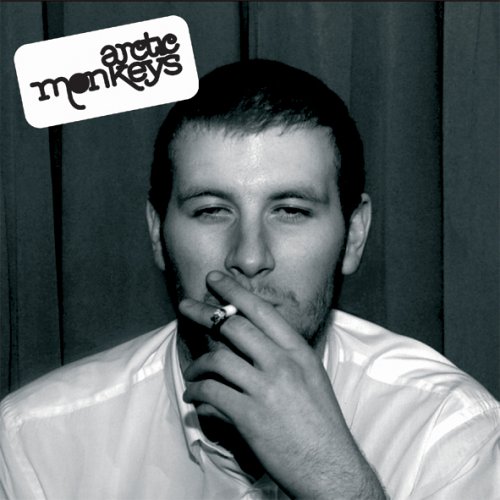
As with other digipaks I have analysed, this album - Arctic Monkeys' debut release Whatever People Say I Am, That's What I'm Not - follows some conventions relevant to it's own genre, a hybrid of garage rock and indie pop/rock. For instance, the black and white effect on the photo is distinctly similar to the colour scheme used by indie band The Kooks on their debut album Inside In Inside Out. The album cover is ostensibly simple, however, many techniques have been employed to create an image in the mind of potential consumers and provoke certain reactions. The first interesting point is the fact that the man on the front of the album isn't actually a member of the band, which will evoke curiosity from loyal fans who will question the relevance of the individual on the front of the album. The way in which the bands logo has been embossed on the top left hand corner of the album is also intriguing - it suggests a carefree/carelessness about the album, it looks as if it has been stamped on without being given a second thought. Not only that, but the fact that the man is smoking a cigarette (which has been made incredibly conspicuous) also connotes that the album is aimed at young people, who in the modern day media are painted as rebellious and angry youngsters that like to 'fight the system'. The fact remains, though, that the image of a man smoking appeals to a young demographic who indulge in the unhealthy infatuation of doing things they have been warned not to do. In addition to this, the man is clearly under the influence of some drug (presumably alcohol), which again young people can relate to, as this is a notion that the album thrives on: nearly every song on the album involves lyrics that encapsulate a typical night out for pretty much anyone under the age of 25, probably younger than that. This allows the consumer to empathize with the man who looks disorientated and incoherent, but this is what young people can relate to - they can see glimpses of themselves in the man's demeanor. The black and white effect on the photo denotes a sense of nostalgia and individuality, traits used by many other indie bands to give the album a retro image. The album cover appears with only one image, the bare minimum they could have placed on the front of the album - this connotes that the band are focused exclusively on making music rather than creating lavish album covers and an exorbitant image. This indie ethos appeals to the fans and adheres to their target demographic. The typography used in the logo is slightly more flamboyant than that on The Kooks' album, although this logo has been used ever since it's inauguration which connotes that the band set out to create a brand identity to make them recognisable to their fans and meaning that they can gain easy exposure through advertising etc.
Need To Increase Your ClickBank Traffic And Commissions?
ReplyDeleteBannerizer makes it easy for you to promote ClickBank products with banners, simply go to Bannerizer, and grab the banner codes for your favorite ClickBank products or use the Universal ClickBank Banner Rotator Tool to promote all of the ClickBank products.