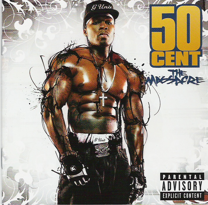
50 Cent's The Massacre digipak has been designed/formulated to boost his street credibility, reputation and sex appeal. The artist is surrounded in what appears to be an ink of some sort, although it could be something else. This 'ink' further accentuates his muscular physique, creating more striations across his body to make him seem more intimidating to other men whilst also painting him as more sexually provocative and appealing to the opposite sex. The attire he is wearing (shirtless with gloves) connote he is aggressive - the gloves look similar to those that would be used for fighting in fight clubs (MMA). However, the presence of the christian cross he bears around his neck means that the image is somewhat of a binary opposition: he looks rough, masculine and ready to fight, however, the christian cross is a symbol of peace and love, which completely subverts the message he is trying to get across through his fighting attire. Although, the cross itself appears very lavish which denotes that he is wealthy, again boosting his reputation and self image. He is completely centralized and takes up a huge proportion of the frame to ensure he is the first thing the consumer sees when picking up/looking at the album; adjacent to him is his name in large gold typography, ensuring that it can be spotted easily and that it is unmistakable.Gold is considered expensive and luxurious, which relates back to the necklace and how 50 Cent is seeking to promote his self image as a positive and wealthy 'alpha male', it also menas the text contrasts nicely against the white background and is not difficult to decipher. Another intriguing aspect about the album cover is that the title (located underneath the bold typography "50 CENT") "The Massacre" is styalized in a way the relates to the word 'massacre' which is essentially a brutal and messy slaughter of a vast number of people. It is not a coincidence that the title has been written in a way that looks as though it has been 'scratched' into the album with a sharp implement, in (apart from the text's blue colouring) what could otherwise be described as blood. I think the message the artist is trying to convey is that after being one of the most acclaimed rappers in recent time, he has essentially 'massacred' all other artists - the album title is an extended metaphor for how he has surpassed the acheivements of many of his rivals. [UNFINISHED TO BE CONTINUED]
No comments:
Post a Comment