The Stone Roses: Stone Roses
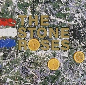
This album boasts incredibly abstract features that are appealing and easy on the eye. The art is actually a product of John Squire's (Stone Roses lead guitarist) painting, the abstract backdrop in conjunction with the bold gold typography embosses the bands name to ensure it is clear and visible. Squire's piece has been heavily influenced by Jackson Pollock's artwork - a painter who was pivotal in the abstract expressionist movement - essentially it connotes that the band are not looking to represent external reality, but they are manifesting subliminal messages through abstract work that can be interpreted in a number of different ways - by fans buying the album, they are giving their artwork their own meaning. The French flag on the far left side of the album pays homage to the May 1968 riots in Paris, where the use of lemons where found to be a viable antidote to tear gas. The fact that the band would choose to reference such an event to support the release of the album is in itself a demonstration of the bands contribution to the rock/indie subculture: the majority of bands were still fixated on covers boasting self-portraits of the band/artist posing in dignity or photos of the band in peculiar situations. At first glance, the albums backdrop can easily be mistaken for an image of a map or a birds eye photograph of a western european country, which makes sense considering the ideologies and inspirations for the album. The typography is specifically designed to attract attention, it is a no-nonsense bold lettering makes the band's name (essentially their brand/identity) unmistakable. Not only is the typography appropriate, but the use of gold lettering contrasts the background well - making the text stand out - but gold is also an incredibly prestigious that connotes wisdom, magic and passion, whilst the metal gold is an incredibly lavish commodity.
The abstract nature of the painting compels the consumer, forcing them to further analyse and ponder the albums imagery. The cover is thought provoking, which encourages the consumer to pick the album up and contemplate buying it without even giving thought to what is undisputably the feature of most importance in an album - the music. The album highlights just how important an identity is to a band, and also the significance an album cover bears on how many copies it sells, an album cover design should not be underestimated as it is one of the single most efficient methods of marketing the product.
No comments:
Post a Comment