This is the survey I have created to collect feedback in order to inform my evaluation of my products via audience feedback.
Please take a few moments to fill this out to contribute to my audience feedback:
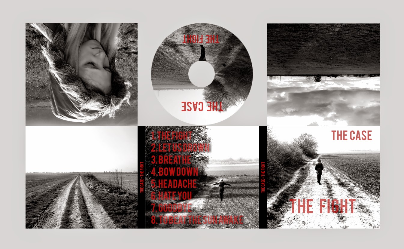
Monday 27 April 2015
Final Video
This is the final cut of my video, I have made a plethora of changes since my first cut including the way in which I have generally just collated more footage and made use of this footage far more effectively, I needed to incorporate far more close ups which I feel I have done as it has allowed me to capture more expression/emotion of the protagonist. There is a great difference in quality from my first draft, as for a start I learnt how important the use of rendering is in Premiere Pro in order to get the smoothest playback possible, I learnt that clips with a red bar above the work area was a signal that the footage definitely needed rendering, whereas yellow was a sign that the footage did not need rendering but it would help if the clip was rendered.
The premise of the song is that relationships can be psychologically abusive and emotionally stressful, however, I have chosen to present this more through the use of a child and outlining how many young people are still subjected to bullying and psychological violence is still a problem within our society at all ages. It also shows that children should not be made to suffer in silence and should open up about their problems.
The video postulates that young people should maintain happiness and youthfulness for as long as possible, and bullying/psychological violence should not be tolerated in a healthy and diplomatic society. It manifests how a girl who really should be enjoying the best years of her life (stress free and in good health) has become a subverted stereotype due to those around her psychologically abusing her quite possibly due to the influence of the new media poisoning the minds of younger citizens, it also makes use of high angle shots to fulfil these connotations and some shots that seem as if the girl is being watched unbeknown to her, almost like a kind of 'Big Brother' method of filming. Essentially using a male gaze to make her look even more inferior and insignificant in conjunction with costume.
In essence, it is a girl who is psychologically tortured for no other reason than that some people genuinely find hedonism from belittling others, and it shows how the innocent girl should receive sympathy as she finds happiness in the simplest of ways such as nature and the environment around her rather than engaging in media such as video games all day like other children do. It should give the audience catharsis and elicit/evoke a sense of sympathy from the audience.
Digipak: Final Edit of Digipak
Below is the final edit of my digipak, the changes needed were minimal as all I needed to do was adjust the levels of opacity in the typography on the posterior panel of the digipak to make the track listings easier to decipher and make the name of the album and the band name on the anterior panel (front cover) clearer for the same reason.

As you can see, I have adjusted the level of opacity in the typography on the front of the digipak and also on the disc itself as well as the track listings on the back. This has ensured that the text remains striking against the (now) more black and white, monochrome background. This is the final edit of my digipak which me and my teacher both agree has seen significant development since my first draft. and is now a marketable product suitable for promoting a musical entity. The final draft of the digipak was (as I have alluded to) strongly inspired by U2's album "War" (1983). This is something that intrigued me: the album I have based the digipak on was released in 1983, a very similar time to which Guns N' Roses (who the band cite as a major influence on their music and image) formed (they formed in 1985). This correlation reassured me slightly that this is (despite the fact I have subverted many conventions) quite a viable digipak to use as a means of marketing the band and promoting their brand identity.
Moreover, I am happy with the latest design for this digipak and do not intend to make any changes as this may overdo the look which would oppose the minimalist approach I am striving for, which me and my teacher (upon comprehensive feedback) agree, is a good idea.
Magazine Advert: Final Advert
This is the final design for my magazine advert and I have made all the suggested improvements that my teacher has asked me to make.

I have adjusted the opacity of the typography so that it appears clearer against the background which makes the typography more striking against the monochrome. I have also reduced the size of the stars to draw more attention to the quotes reading "Breathtaking - NME" and "Album of the Year - Q". I have also (as with the digipak) adjusted the darkness of the poster to make it more indie/rock and less dull and grey as it was before. Apart from that I had no further changes to make and my teacher approved of the final poster as I had applied all the new changes I needed with ease as I have become far more proficient with the editing software - this was produced using Adobe Photoshop CS3.
Digipak Developments: Third Draft
This is the third draft of my digipak which I have made adaptations to subject to recommendations from my teacher, who upon evaluating/reviewing my second draft digipak informed me that he disliked the typography and felt it was not suitable for a hard rock/indie band. He also brought my attention to the use of levels in photoshop: he told me that the album cover appeared to be more grey than black and white - which were the colours I originally wanted to use in order to achieve the monochrome, minimalist effect I wanted to represent the band's brand image. In addition to this we discussed how the idea of adding a spine to the digipak to give it more of a professional look - ensuring it looks like a product that could actualy appear on the shelf in HMV or another popular music outlet.
As recommended by my teacher during feedback, I have adapted the levels in the photos to make the images more black and white through adapting the chiaroscuro elements of the image to give it that 'indie/rock' edge. The effect of the black and white shades rather than the more dull/vague grey colour is that it subsequently makes the red typography far more striking and visible to see - however, my teacher did point out that the opacity of the typography on the anterior panel, posterior panel, spines and CD itself needed to be reduced to make the typography far more striking and clearer against the back ground. It is clear that on the anterior panel (front cover) that the text ("The Fight") appears quite faint as it is against a very white background - this is a change I will have to implement for my final draft of the product.
Overall, the digipak is essentially finished as my ability using the editing software (Photoshop CS3) has developed significantly throughout the production process, whereas I made the images more of a grey in the previous draft of the digipak, I discovered that by selecting Menu > Layer > New Adjustment Layer > Black and White I could achieve the effect that I wanted to achieve. Following this, I would then select Levels > Chiaroscuro and tweak the sliders to get the black and white monochrome effect I have set out to achieve since the inaugural stages of my planning. My ability to use the editing software has begun to burgeon recently, which has directly affected the way in which I am able to either adhere or subvert conventions which will effect the way in which my product is perceived.

Depicted above is the second draft of my digipak, and this displays the significant changes my product has gone through over the course of the production process - notice the more dull grey tone to this digipak - the text appears less striking against it and the colour contrast between the light and dark shades is far less pronounced - compare the top left hand panel of each digipak and the difference is clear, the light reflected of the coat is bright whilst shadowed areas appear far more dark i.e. the inside of the hood and certain strands of fur round the periphery of the hood. On the other hand, in the digipak depicted above, the image in the top left hand panel appears as one very bland, insipid shade of grey. Also noticeable is the difference in typography between the two products: the second draft uses a far less suitable typography: it seems very basic and quite unsophisticated, almost like a comic sans type of font which is not suitable for a rock band.
Despite the changes I have made to the digipak, my teacher has advised that I adjust the opacity of the typography in my final edit - he told me that is does not make as much of an impact and that the text would appear far more striking against the monochrome background - he informed me that this is the only change required to get my product to a high level.
As recommended by my teacher during feedback, I have adapted the levels in the photos to make the images more black and white through adapting the chiaroscuro elements of the image to give it that 'indie/rock' edge. The effect of the black and white shades rather than the more dull/vague grey colour is that it subsequently makes the red typography far more striking and visible to see - however, my teacher did point out that the opacity of the typography on the anterior panel, posterior panel, spines and CD itself needed to be reduced to make the typography far more striking and clearer against the back ground. It is clear that on the anterior panel (front cover) that the text ("The Fight") appears quite faint as it is against a very white background - this is a change I will have to implement for my final draft of the product.
Overall, the digipak is essentially finished as my ability using the editing software (Photoshop CS3) has developed significantly throughout the production process, whereas I made the images more of a grey in the previous draft of the digipak, I discovered that by selecting Menu > Layer > New Adjustment Layer > Black and White I could achieve the effect that I wanted to achieve. Following this, I would then select Levels > Chiaroscuro and tweak the sliders to get the black and white monochrome effect I have set out to achieve since the inaugural stages of my planning. My ability to use the editing software has begun to burgeon recently, which has directly affected the way in which I am able to either adhere or subvert conventions which will effect the way in which my product is perceived.
Depicted above is the second draft of my digipak, and this displays the significant changes my product has gone through over the course of the production process - notice the more dull grey tone to this digipak - the text appears less striking against it and the colour contrast between the light and dark shades is far less pronounced - compare the top left hand panel of each digipak and the difference is clear, the light reflected of the coat is bright whilst shadowed areas appear far more dark i.e. the inside of the hood and certain strands of fur round the periphery of the hood. On the other hand, in the digipak depicted above, the image in the top left hand panel appears as one very bland, insipid shade of grey. Also noticeable is the difference in typography between the two products: the second draft uses a far less suitable typography: it seems very basic and quite unsophisticated, almost like a comic sans type of font which is not suitable for a rock band.
Despite the changes I have made to the digipak, my teacher has advised that I adjust the opacity of the typography in my final edit - he told me that is does not make as much of an impact and that the text would appear far more striking against the monochrome background - he informed me that this is the only change required to get my product to a high level.
Thursday 16 April 2015
Digipak Second Draft
I decided to put into practice new skills I have acquired from tinkering with my chosen software by re-designing my digipak in a more suitable manner to better adhere to the codes and conventions of rock/indie digipaks and creating something closer to the final product that will be put out to market/promote the band.
After researching digipaks/album covers and artwork I have finally put together a first draft of how I would like my digipak to look. It is composed of six photos that have been thoroughly edited on Adobe Photoshop CS3 in order to achieve the monochrome effect I wanted. I feel the cover is somewhat analogous to "The A Team" single cover by Ed Sheeran which has essentially brought a sense of bricolage to my work, whilst also incorporating elements of pastiche into the production process which (arguably) makes the digipak in itself postmodern. I have made a the changes I wanted to make - these were discussed in the review of the first draft of my digipak that I made without having conducted sufficient research into other products of a similar genre/archetype.
Firstly and more fundamentally, I needed to include track listings on the back of my product as the product needs to be informative as well as aesthetically pleasing - it is also logical that when browsing through CD's in music outlets, potential consumers will inevitably flip the digipak round to analyse the posterior of the product to see whether or not their favorite tracks are featured on the album. I also had to edit the photo on the posterior so that I could arrange the text around the photo of the girl, although this was very basic editing that required re-positioning the layer. On the other hand, the 'sketch' effect on the front of the digipak required significantly more time and effort to achieve using more advanced editing techniques - which I feel documents how my capabilities to use the editing software has in turn given me more creative freedom. I feel my ability to use editing software has allowed me to create a more appropriate product, although this is only my second draft I feel it has developed incredibly well in retrospect of the first draft of the digipak.
I have allowed my research/analysis of other digipaks to inform the production process of this digipak, for example, approaching the cover of the digipak with far more of a minimalist approach than when designing/producing the last product. This idea was derived from Ed Sheeran's album cover, and the typography (simple, bold, very minimalist) and positioning of the text was influenced heavily by both Sheeran and The Killers' album covers, positioning the name of the artist in the top left hand corner of the cover and placing the name of the album in the bottom right hand corner of the cover.
With regards to the actual production of the image on the front of the digipak, I encountered a large learning curve but after researching the techniques/editing tools required I was able to create some rather interesting textures/effects - by developing a more eclectic knowledge of Photoshop CS3, it allowed me to expand creatively and get my ideas across more easily - an example of how the technology itself plays an integral role in allowing the user to make the product postmodern/poststructuralist etc. in essence, technology is a tool that allows us to create postmodernism.

The cover was created through a number of processes of which I was previously unaware: firstly I had to change the blending mode of the layer to "colour dodge" before I right clicked the layer and selected "luminosity". I then clicked "filter" followed by "blur" and then "gaussian blur" - this gave the image the slightly distorted and contrasted look that I wanted to achieve. However, I still had to make certain adaptations in order to give the cover a more complete edge.
.jpg)
I then clicked on the layer settings and reduced the opacity of the image, which added to this 'penciled' effect that I wanted my cover to have in order to bear a slight resemblance to "The A Team" cover. Obviously I did not want the image to be completely transparent, this would be ludicrous, so I reduced the opacity until the image was at a point were outlines in the photograph were still clear but other elements of the image had a tarnished effect to give it an eroded 'indie' effect similar to the effect seen in my ancillary research.
.jpg)
I then selected "create a new fill or adjustment layer" followed by "hue/saturation". This allowed me to adjust the saturation of the image to give it either a more full or more tarnished effect - I opted for the latter for the more minimalist option/aesthetic.The 'tarnished' and indie quality to the cover came as a result of reducing the saturation as depicted below, whilst hue remained neutral. Upon research, I found out that the terms "hue" and "saturation" refer to the colour and purity of the image respectively.
.jpg)
The main reason my digipak has improved is not my ability to think up abstract ideas of how I want the image to look: I have always had quite a vivid idea of how I want my digipak to look as collating my ideas manually has never been a problem for me; it is more the fact that I have developed a stronger understanding of the software which has allowed me to actually apply my ideas and start producing them in tangible format. This shpows that there is certainly a correlation between proficiency with using software and also creative freedom - it allows you to be slightly more expressive in your ideas even if (like me) the individual is aiming for a minimalist approach.
However, upon teacher feedback, I was informed that the digipak needs the levels adjusted to make the covers more black and white than the dull grey it currently is - meaning I can use my development in technology skills to help me adhere more closely to conventions. The covers also needed to be flipped as well as some of the cover(notably the top row of panels) would appear upside down on the real product if I do not flip them which will lose the artist credibility and make the overall product look more professional. In addition to this my teacher recommended that I add a spine into the digipak to make it look professional as well as original and allow it to be picked out more clearly from a shelf were it to be sold in a record shop.
Tuesday 14 April 2015
Magazine Advert

This is the first draft of my magazine advert, I again made it using Adobe Photoshop CS3 editing software which I have made significant improvements on, I am now able to express myself with more creative freedom due to my advances using the software over a number of weeks. I used the same image as I had used for the cover of my digipak in order to retain a sense of continuity and brand identity, so that the band are identifiable to the target demographic. The image was inspired by the cover of Ed Sheeran's "The A Team" - which I have referenced throughout my project and I cite Sheeran's minimalist approach to his work as a huge inspiration to my own. I liked the idea of the girl walking away from the camera alone encompassed in a large environment to make her look all the more isolated.
Although it seems incredibly peculiar and breaks all conventions of my products, I had always had the idea in the back of my mind (ever since I knew I would be using my younger sister as the lone protagonist in my video) that the digipak would bear some resemblance to Eminem's 2010 album "recovery" - it shows the artist walking into the distance within an environment of incredible magnitude in terms of size in order to connote isolation, in the case of Eminem's album it serves as an extended metaphor for the lonely journey he has taken from drug addiction to sobriety which, although isn't the case in my video, still remains valid for my poster/advert/digipak. The metaphor in my product speaks much more about bullying towards young people and how the youth of today can often be made to feel alienated due to intense pressure thrust upon them by the media forcing them to fit into trends and keep up with the burgeoning developments in fashion, technology, media, social trends etc.

Despite the fact the genre completely contradicts that of the artist I am producing for I felt the image was suitable for my own product, which has meant me risking breaking some conventions by allowing a hip-hop/rap album to inform some of my product research and design it brings a sense of diversity and a more eclectic dimension to my product. I have also framed the protagonist in a similar fashion by deliberately not placing them directly in the centre of the screen, this connotes somewhat a lack of importance and also allows for a more central view of the vanishing point.
However, upon feedback from my teacher (who also analysed and helped me formulate a revised plan for my digipak) noticed that the poster (like my digipak) is actually more of a grey colour rather than black and white - which is the look that I intended to acheive. This meant that I would have to adjust levels and contrast on photoshop to make the image darker and more striking and less dull. it also meant me adapting the elements of chiaroscuro in the image to make it more iconic. Chiaroscuro is merely a photography term that refers to the composition/treatment of light and shade in a picture. I feel that I want the girl to become somewhat of an icon in my video and recognised for certain characteristics so that she literally becomes an icon. I want the protagonist to become a symbol through the way I portray her in the video and the way in which I use certain photos and editing techniques in my ancillary texts - which is why I have chosen to frame her on her own throughout my video and ancillary texts. This makes the girl a sign - a symbol almost which then goes someway to making her indexical: you see the girl and this signifies isolation, that isolation is a theme. This is the approach I've taken to supplement my editing and use semiotics to help convey ideas/codes and conventions to the audience. This may seem quite far fetched, but I believe with the right editing and by further developing my magazine poster I can create a very well improved, revised second draft for my magazine advert.
Another piece of teacher feedback I have to take into account is that he feels the stars on the poster are too big and over elaborate - he said that they draw the viewers attention away from the words "breathtaking" and "album of the year" which are important for the viewer to read when analysing the poster - this is the final change I will have to make for my magazine poster in order to get it to a respectable standard.
Friday 10 April 2015
The Case - "The Fight": Second Draft (Second Shoot)
Above is the second cut of my video, I have made significant changes to it since my first cut and mainly just included a lot more footage than I had previously so that I can get a rough idea as to what my video is looking like. I have also included a time lapse in the video (02:04 - 02:10) which was inspired by the time lapse from the video "Sweet Child O' Mine" - I want to create a graphic match that will be recognisable to my target audience who (upon analysis of survey results) manifest a keen interest in this style of music and so will be able to relate to this intertextuality in the video and will hopefully gratify them as an audience. In order to film this time lapse, I had to stand in the field for fifteen minutes using a high angled shot in order to capture the sky and also include some of the field within the confines of the frame to capture the dramatic effect of the shadows (projected from the clouds) moving along the surface of the field to create a sense of pathetic fallacy within the video. I then had to import this footage into Premiere Pro and cut/trim the clip as I encountered some adversities when filming such as dog walkers and general pedestrians being included in the shot which was not what I wanted as this would ruin the dramatic effect I intended for my video. In addition to this, it was important that I retained the monochrome effect to maintain synergy between all the scenes in the video, as I originally wanted to include this as the only shot in the video to include colour, however, my teacher advised against this strongly and said that it would break the continuity of the video. After applying the monochrome effect to the clip I right clicked the footage and selected (Speed/Duration...) and then slowed the pace at which the clip is played - this is another way that my development on new media software/technologies allowed me more creative freedom in the constructive process of creating my product, meaning that I can be more incisive in the decisions I make and more direct when creating the video, rather than having to compromise due to a lack of proficiency on the software.

Depicted above is the process by which I was able to apply the effect of a 'time lapse' in my video, this gave the effect of the girl being insignificant, giving the impression that even as time moves on and the world advances, she is left behind and almost forgotten. Following this I then adjusted the pace/speed of the video accordingly as depicted below.

After I had applied this effect, I noticed that upon playback of the video the time lapse appeared very jumpy and lagged significantly (to my frustration) and I could not work out why. However, I then conducted some research into Premiere Pro and realised that my video needed to be rendered in order to give it a smoother playback.

By selecting "Render Entire Work Area" I was able to render the entire video which meant a green bar appeared above all the clips I had selected to be rendered in the Premiere work area, and this allowed for smoother transitions between shots and sequences and a smoother playback for my time lapse which now appears far more professional. I later found out that as a short cut, simply pressing the enter key on the MacBook allowed me to render the entire video.

Depicted above: the green bar that indicated that the footage had been rendered. This was important to check before exporting the footage as I wanted to make sure the quality of my second cut was good - this is also something I will have to pay close attention to before exporting my final cut as I will have to ensure that it is of the highest quality before it is moderated, ironing out any creases that may be present in the video.
The majority of my filming in the second shoot was done without the use of a tripod, as this is something I noticed was a commonality among some of the videos I have analysed ("Sweet Child O' Mine" being the most notable example) and it allowed me to capture the video with connotations that it was more of a 'documentary' than a music video, which certainly added to the verisimilitude of the second cut of the video. I have added almost a montage at the end of the video, a sequence of shots inter-cut with other more dramatic shots (girl ripping the paper and crying etc.) and I have done this in a way so that the cuts have been done in time with the beat of the drum or the guitar riff - this will help me establish a good relationship between the audio and the visuals (another convention I unearthed upon researching the subject) which will make the text easier to decode for the audience. In addition to this I have also included a shot that matches the audio: at 02:24, when the vocalist screams "I've got to run away" I have matched the audio and visuals together by including a rather dramatic shot of the girl running away (embodying the songs lyrics) in slow motion. I believe this coupled with some of the binary oppositions I have included in the video, such as the concept of the girl playing in the playground and swinging on the swing whilst manifesting a very pensive, depressed expression have allowed me to encode genuine meaning into my video in order to help me get more marks.

This is how I applied the black and white or 'monochrome' effect in the video, which has been used throughout the video to maintain a certain level of synergy in the video that will work well in conjunction with my ancillary texts.
Now it is merely a case of filling in the gaps, thinking of an effective ending (this is all teacher feedback) and making small tweaks to lighting and colour correcting the video before conducting a comprehensive and meticulous evaluation of the product.
Thursday 9 April 2015
Digipak Ideas
In order to further inform research for my digipak drafts, I have further analysed more digipaks/album covers from bands of a similar genre/similar design to what I would like to achieve. Note that the video was filmed in black and white when released to the UK, much like the digipak/album cover. This album cover is black with a shade of white that is almost beige, a sort of dark cream/ivory colour.

Ivory is considered quite a sophisticated colour that connotes a calmness and dignity, which my reflect what the band feel they would like to be considered as. Cream/Ivory essentially signify/connote purity and innocence - which for a start is a binary opposition because the meaning behind the song essentially "depicts the jealousy and paranoia of a man who suspects his significant other is cheating on him" - http://en.wikipedia.org/wiki/Mr._Brightside
This therefore establishes a clear binary opposition - using colours associated with purity and innocence, arguably warmth to represent a song about an unfaithful lover is done essentially to present two concepts with entirely different meanings that conflict each other in every way. This gives the artwork a sense of irony but also evokes an intriguing interest from consumers - it would be expected that a picture of a man and a woman who share an intimate relationship with each tother would be printed to maintain some relativity, however The Killers and/or their marketing team had clearly chosen to subvert this convention.
Another commonality between this and the other digipak i have analysed (Ed Sheeran's "The A Team") is that the name of the track is positioned very low in the bottom right hand corner of the cover in very basic (but still sophisticated) typography. Again, this can be attributed to the desire of achieving minimalism and to demonstrate a work ethic that focuses entirely on the production of the music. This is because many of the fans will never actually get to meet the band, but the artwork on album covers and promo videos resonates through to the fans and they subconsciously form an opinion of the band based on these factors. The image itself is actually quite difficult to decipher which renders it with some ambiguity: it seems that it is an archetypical American highway which could be symbolic for a number of things. It could be symbolic of life's complications and how it is an emotional roller coaster, especially in the context of the narrative and that we all face ramifications in life. However, it could also be to target an American demographic who will immediately recognise this style of road/highway and so it may be to grab the attention of their target audience.
Digipak Ideas
In order to help me construct an effective digipak I have researched into bands/songs that have produced similar videos to the type of video I would like to produce, therefore, I feel it is important to blog this progress to help me collate ideas and get a more vivid idea of what I would like my digipak to look like. Having composed a very rough first draft of my video, I understand that there has to be a clear correlation between my digipak and my video to give the artist credibility and to maintain continuity. I will be analyzing digipaks for texts that were either filmed or produced in black and white and that are somewhat similar musical styles to the artist I am producing for. I have produced a first draft of my digipak, however upon analyzing it more meticulously it seems there are some discrepancies between the content in the video and the pictures on the digipak.
Ed Sheeran - "The A Team" Artwork
 The cover depicts the protagonist of the video walking with her back to the camera, which connotes a lack of identity, insignificance and hints at ambiguity. The composition of the cover also maintains relevance to the text: the black and white effect that the text was filmed in has been retained and making the the project as a whole more 'neat' which gives the artist more credibility but also gives the work itself an identity, a way in which it can be recognised - using more bright colours on the digipak may have confused fans as it would have been difficult to associate the digipak and the video. This is one of the early problems I encountered in my work - there was a clear discrepancy between what I had filmed and the artwork on the digipak - my first draft featured no photos of the protagonist and all photos of the locations in which I filmed were in colour. Also, the main feature of this digipak is the protagonist who takes up a large portion of space within the confines of the photo and has been sketched in a very dark shade of black - another interesting feature of the digipak and also the artist Ed Sheeran himself. Album covers that feature drawings/sketches have become somewhat of a trademark for Sheeran, as his album "+" features similar textures that look like very detailed sketches.
 Depicted above is another example of Sheeran's album artwork, which feature photos that have been cleverly converted into pencil sketches via meticulous editing. The immediate effect of these detailed drawings is that it gives the artist an identity, a trademark by which he can be recognised - an artist or band must be recognised as a brand therefore my ancillary texts (digipak and poster) must be of a very similar style maintaining some distinct features to help get the band recognised. But back to the original cover for the A Team, it features small lettering rather than larger, lavish print which goes a long way in reinforcing the artists intentions of focusing solely on making music rather than the more lucrative side of the industry, and promotes a healthy image for the artist with connotations that he is leaning towards a minimalist approach to his music. The small text coupled with simple typography goes even further to establish the artist's intentions to focus on the music itself rather than the lavish and luxurious production tools they have at their disposal which is another feature which denotes that Sheeran is a proponent of minimalism. The sketch effect that has been put on the A Team cover also bears similarities to other minimalist art:
 The textures used in this sketch feature the bare essentials of the facial features and shading where appropriate, no water colours have been used and the sketch encapsulates the modern day minimalist sketch, this sketch is analogous with Sheeran's album cover which supports the argument that the artist (Sheeran) is striving for minimalism to gain respect from fans and other artists. Another notable feature of Sheeran's work is his logo; his name in typography that features a slightly 'fuzzy' rough-around-the-edges look coupled with a paw print - a symbol that has come to define him and his work in recent years. The paw print has become somewhat synonymous for Sheeran's work since his rise to success - stemming from a sticker used to adorn his acoustic guitar from way back to some of his first gigs that has remained with him today and allowed him to become a marketing machine - it is probably this that the fans respect him for, despite Sheeran's success he remembers where he came from and has remained down to earth still using what looks like a neglected acoustic guitar to perform at gigs with.
 Above is Sheeran's acoustic guitar with the famous paw print that now serves as a symbol/representation of his work, used to decorate a seemingly neglected guitar which contributes to his indie image - as I have alluded to previously, many things in the indie genre are 'rough-around-the-edges" such as the camera work used in music videos and also clothing (ripped jeans etc.) and Sheeran has kept this trend going however he embodies this through his instruments. It may seem pedantic, but small it seems small details like this go a long way in producing a successful digipak that gives the artist a brand identity.
 Depicted above is another example of how the logo has become a trademark of Ed Sheeran's work, it is one of the first things featured in bright white and bold on the famous 'Carry On' memes which have experienced exponential growth in recent years. In essence, the point is that a digipak needs a number of different features to give it credibility depending on the genre and the target audience/demographic, and a logo that the band can be recognised by is just as important as the digipak it is printed on, it gives the band/artist recognition. This meme has also been done in orange which is, again, synonymous for Sheeran's work.
The fact that the album cover is merely a sketch almost 'simplifies' it, as if it has taken merely pencil and paper to produce the cover (despite the fact it would have taken photos and adequate editing software to produce this look)- another reference to minimalism and also the typography in which the title has been produced - "The A Team" is written in a font that looks very basic and eroded, broken. This embodies many of the themes in the song/video: a sex worker who has very limited resources and has been broken by society, who is relying on bare essentials to get by and earn a living.
Ed Sheeran - "The A Team" Artwork
The fact that the album cover is merely a sketch almost 'simplifies' it, as if it has taken merely pencil and paper to produce the cover (despite the fact it would have taken photos and adequate editing software to produce this look)- another reference to minimalism and also the typography in which the title has been produced - "The A Team" is written in a font that looks very basic and eroded, broken. This embodies many of the themes in the song/video: a sex worker who has very limited resources and has been broken by society, who is relying on bare essentials to get by and earn a living.
Subscribe to:
Posts (Atom)