Friday 19 December 2014
Narrative Structure
After discussing my storyboard with my teacher, we felt it was appropriate to experiment with different narrative structures and the possibilities of rearranging certain shots/scenes and the impact it would have on the narrative. Therefore, I have decided to rearrange my storyboard numerous times to gauge exactly how it will effect the perception of my music video. This is relevant to Todorov's narrative theory. The narrative will be though provoking, it will present the struggles of a young girl (around the age of 8-9). I will also be analysing some popular narrative videos to help me collate research and further understand the importance of narrative structure taking into account Todorov's theory.
Monday 8 December 2014
Costumes/Props
In order to create a sense of verisimilitude in my production I have had to organise some costumes/props to make the video as a whole seem more believable. Therein, as I have chosen my younger sister to star in the production. I have been researching music video extensively, and, as Pete Fraser alludes to in "Teaching Music Video", the Mise en Scene is of much importance as it is "the combined effect of a series of visual elements within the frame of a visual text, such as costume, props, decor, figure placement."
Therein, in order to further help me and be more incisive in creating the production, I have photographed the costume that will be worn by my younger sister with a photo of a prop that I will use in my video. This planning will allow me to be more concrete in the actual production of the video and so by collating my thoughts now it will allow me to foresee how it will pan out.
 This is the coat that will be worn by my younger sister who is nine, I intend her to wear it fully zipped up with the hood up to connote a lack of identity and insignificance - just like the girl who wore a large jacket and a hooded top in the A Team which created the effect of her seeming inferior physically and conceptually. Luckily the colour of the jacket is quite dull which will work well in conjunction with video effects on Premiere Pro such as black and white and colour correct (which isn't technically an effect but it may still have to be altered). The fur hood will go far in obscuring her face in some of the video and creating ambiguity. The coat also denotes that the weather outside is pretty unpleasant which does well in creating the effect of pathetic fallacy, essentially echoing the emotions of the girl wearing the coat who needs to be made to look smaller and more vulnerable - this parka style jacket does exactly that. I knew as soon as I was using a young actor that I would need them to wear a coat of this sort of style, it would be useless if she was wearing a fluorescent cardigan in the sunshine, the narrative/visuals need to go some way in matching the audio/lyrics.

Depicted above - a mid shot from Ed Sheeran's "The A Team" with the girl sporting hooded jumper and large coat with the hood up - this denotes that she is obscured from society and also that he is generally trying to keep warm in cold weather and is suffering from a lack of shelter.
 Another photo of the coat from the front.

During the inaugural scenes of the video, the girl will be reading a note she has found in her school bag, and so in order to match this and bring an essence of verisimilitude to the text she will be wearing school uniform attire to connote a sense of realism. The cardigan is a maroon/burgundy shade and quite an autumn like colour, it is not too bright and so it will not look ridiculous when black and white effects are applied to the piece, it also bears her school's logo/badge on the left side of the chest which clearly shows that it is a school/educational institution of some sort and not a fashionable piece of attire - this also goes a long way in establishing that she is very young and is not even in secondary school yet. This does well in embodying the lyrics of my chosen song: "the youth you've strangled in us it brings me to disgust". This is also why it is a good idea to ensure it is made clear through the Mise en Scene that she is very young, because it can help me reinforce Andrew Goodwin's theory of music videos - the visuals should match some of the lyrical content in the song. A good coincidence is that this cardigan is actually slightly too big for my sister, which will only make her appear more diminutive especially when filming her encompassed by large fields and in long distance shots.
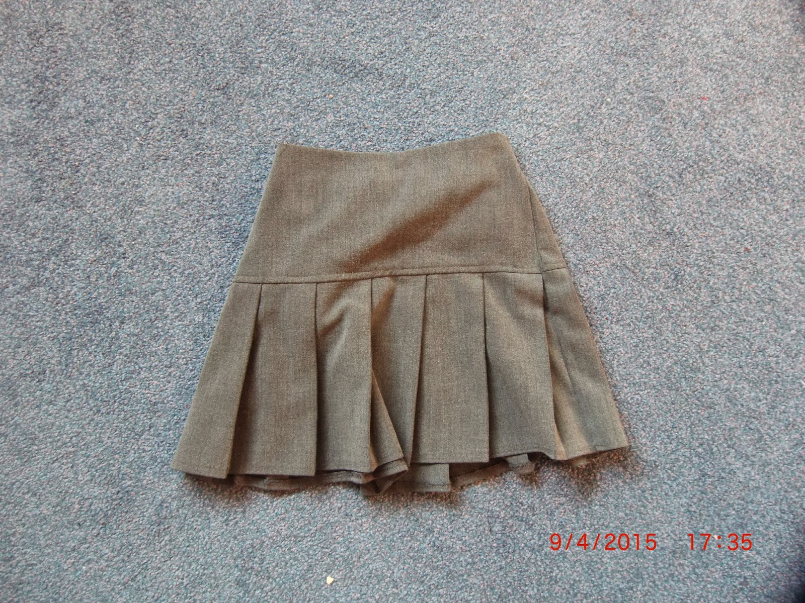
This is another component of my sister's school uniform which I felt was important in continuity and verisimilitude - there would be no point in having her wear her school cardigan and coat if she was wearing jeans or jogging bottoms, it would lose the text credibility and people would most likely become confused by the mise en scene which would impact my production negatively. My actor will be wearing black tights underneath the skirt just to further reinforce the idea of youth to construct meaning and evoke a sense of empathy from the audience. It also connotes innocence and youth, the fact they are grey makes the whole outfit look more dull and miserable - which reflects the way in which the actor will be behaving in the video.

My video will feature this large teddybear at one point or another, I intend to have my actor clutch onto this in a moment of extreme depression (excessive crying) in order to build further meaning by creating another binary opposition - I like the idea of a young girl, who should really be carefree and enjoying the best years of her life, being depressed and clutching onto a teddybear - something that signifies youth, joy and compassion. However, this is not the case, the girl will be clutching onto the teddybear in desperation and in utter sadness (she has read a note containing an abusive message - I am unsure whether I will disclose the message on the note or not yet) and so she has been psychologically damaged by this. In addition to this, the teddybear is white, which in semiotics connotes a youthfulness, a purity and an innocence which is why it will be so effective in helping create a binary opposite. In addition to this, again, the teddybear is very large which will help create the illusion that my sister is incredibly small (which she is) but this will go some way in making her look even more vulnerable.
The residual effect of this prop is that it will elicit a sadness in the audience, therefore evoking a sense of empathy from them as they will be feeling what the protagonist is feeling.
Therein, in order to further help me and be more incisive in creating the production, I have photographed the costume that will be worn by my younger sister with a photo of a prop that I will use in my video. This planning will allow me to be more concrete in the actual production of the video and so by collating my thoughts now it will allow me to foresee how it will pan out.
Depicted above - a mid shot from Ed Sheeran's "The A Team" with the girl sporting hooded jumper and large coat with the hood up - this denotes that she is obscured from society and also that he is generally trying to keep warm in cold weather and is suffering from a lack of shelter.
During the inaugural scenes of the video, the girl will be reading a note she has found in her school bag, and so in order to match this and bring an essence of verisimilitude to the text she will be wearing school uniform attire to connote a sense of realism. The cardigan is a maroon/burgundy shade and quite an autumn like colour, it is not too bright and so it will not look ridiculous when black and white effects are applied to the piece, it also bears her school's logo/badge on the left side of the chest which clearly shows that it is a school/educational institution of some sort and not a fashionable piece of attire - this also goes a long way in establishing that she is very young and is not even in secondary school yet. This does well in embodying the lyrics of my chosen song: "the youth you've strangled in us it brings me to disgust". This is also why it is a good idea to ensure it is made clear through the Mise en Scene that she is very young, because it can help me reinforce Andrew Goodwin's theory of music videos - the visuals should match some of the lyrical content in the song. A good coincidence is that this cardigan is actually slightly too big for my sister, which will only make her appear more diminutive especially when filming her encompassed by large fields and in long distance shots.
This is another component of my sister's school uniform which I felt was important in continuity and verisimilitude - there would be no point in having her wear her school cardigan and coat if she was wearing jeans or jogging bottoms, it would lose the text credibility and people would most likely become confused by the mise en scene which would impact my production negatively. My actor will be wearing black tights underneath the skirt just to further reinforce the idea of youth to construct meaning and evoke a sense of empathy from the audience. It also connotes innocence and youth, the fact they are grey makes the whole outfit look more dull and miserable - which reflects the way in which the actor will be behaving in the video.
My video will feature this large teddybear at one point or another, I intend to have my actor clutch onto this in a moment of extreme depression (excessive crying) in order to build further meaning by creating another binary opposition - I like the idea of a young girl, who should really be carefree and enjoying the best years of her life, being depressed and clutching onto a teddybear - something that signifies youth, joy and compassion. However, this is not the case, the girl will be clutching onto the teddybear in desperation and in utter sadness (she has read a note containing an abusive message - I am unsure whether I will disclose the message on the note or not yet) and so she has been psychologically damaged by this. In addition to this, the teddybear is white, which in semiotics connotes a youthfulness, a purity and an innocence which is why it will be so effective in helping create a binary opposite. In addition to this, again, the teddybear is very large which will help create the illusion that my sister is incredibly small (which she is) but this will go some way in making her look even more vulnerable.
The residual effect of this prop is that it will elicit a sadness in the audience, therefore evoking a sense of empathy from them as they will be feeling what the protagonist is feeling.
Friday 5 December 2014
Digipak Analysis: Lil Wayne - "Rebirth"

Rebirth does not use monochrome features like those that are seen on an array of indie albums (Artic Monkeys, The Kooks etc.). However, the difference in genre is one of the key reasons that the mise en scene and colour scheme on Lil Wayne's album manifest significant differences: he is trying to appeal to a completely different audience/demographic. The album cover poses some form of juxtaposition: rap music is renowned for utilising materials such as 'synth' sounds using computer programmes such as logik, fruitloops and maybe even cock garage band depending on the stature of the artist, however, Wayne poses with a guitar placed across his lap - this causes us to question why he would have a guitar on his person as a rap artist whos songs use no guitars whatsoever. This could essentially be considered somewhat of a binary opposition - rappers who maintain a very macho image and remain loyal to hip hop (almost hip hop/rap 'purists') and guitars that are usually considered 'rock n roll' or 'indie' do not go hand in hand, which is what makes this a very intriguing digipak cover.
As it can be expected a bold and very modern typography is used and centralized within the confines of the frame, this is a commonality I have noticed on an array of different digipaks. The colour of the typography (which features no serifs due to it's more modern look) contrasts the colour of the background image. This is important in catching the eye of potential consumers so that they are immediately aware who the artist is (also due to the image on the anterior of the digipak).
The gold colours used in the image are clear connotations of high status and wealth, which are the exact words that hip hop artists want associated with them. It is also clear that the lethargic position the artist is laying in suggests a certain nonchalance about his personality, as if he is of a high status but almost 'isn't bothered' about it as if to say that being successful is easy. The artist himself is also centralised, and when taking into account the rule of thirds in the mise en scene, this denotes that he is important and the pinnacle of the album - as it is his album. In addition to this, the artist is wearing a white t shirt - white, the colour that represents purity is an interesting choice of colour, and it only adds to the artists lavish look.
Subscribe to:
Posts (Atom)