Friday, 31 October 2014

Digipak Analysis: The Kooks - "Inside In Inside Out"


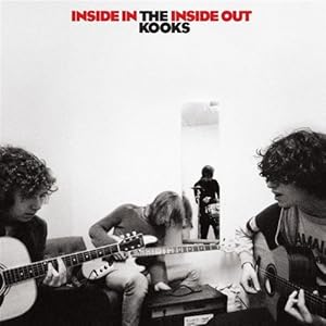
As it was outlined in my textual analysis of The 1975 -"Robbers"  it is common for indie bands to experiment with more low key lighting to achieve a retro finish to their work, again, as is seen in promo's featuring The 1975 (a band who are similar in their indie appearance). All band members are pictured, the formation in which they are sat is particularly interesting - instead of having a picture of the band lined up side by side to fit all members in the frame comfortably, the band are photographed (what we presume) rehearsing, however, the angle at which the photo has been taken has been deliberately employed to maximize audience involvement. In essence, the album cover is designed to make us feel as if we are there with the band, in their presence, which evokes a sense of empathy from the consumer and outlines one of the main themes of the album: The Kooks are a band who formed at university and are ordinary people like those who will likely purchase the album, and the cover of the album supports this notion (the fact that it is their debut album suggests they have only experienced a small dose of fame - perhaps they were popular locally). The typography (which has become a commonality among indie bands) is made up of bold lettering to ensure the title of the album and the band name is unmistakable and embossed for consumer recognition. The album title Inside In Inside Out is given prominence by the striking rich red it is coloured in, only to be made more appealing by the relatively dull, light shade of grey in the backdrop. This makes the name of the album clear to the consumer and means the name will stick in the mind. The black and white effect used suggests nostalgic connotations and gives the album as a whole an anachronistic - essentially qualifying the artwork as 'postmodern': lead singer/songwriter Luke Pritchard cited 60's music as the primary influence on the album, and it is clear from the artwork that the design has made a return to more traditional materials and effects. The colour scheme and typography on the anterior of the album cover is used on all other panels of the digipak to keep it consistent. The album cover seems incredibly simple and it doesn't deliberately go for a particularly lavish appearance, and adheres to indie conventions of avoiding mainstream traits. As previously mentioned, The Kooks are aiming to target a demographic of young people in a similar position to themselves, possibly students with retro dress sense and passion for acoustic music. The fact each member of the band have averted their gaze from the camera connotes that they remain unfazed by media exposure and focus exclusively on making music, manifesting themselves as level headed. The photo of the band itself shows them sitting with each other making music without glamerous studios and recording equipment, a relatively simple environment; an area that could easily be described as a room in a university hall - which makes sense in the context of their target demographic and their social background. The mise en scene in the photo is also textbook indie: skinny (drainpipe) jeans and mop head hair; not too dissimilar to that of The Beatles, is an obvious denotation that the band remain loyal to the indie subculture.
Thursday, 30 October 2014

Digipak Analysis: Stone Roses - "The Stone Roses"

Digipak are the packaging used to market CDs and promote the album/artist. Many types of digipak have been designed in order to draw the attention of potential consumers - designs have usually been designed and refined through extensive market research that targets what the demographic buying the CD find interesting. Digipaks usually comprise of a gatefold or 'book-style' paperboard outer binding and plastic trays capable of holding a CD or even a DVD. Digipaks have become popular as they are far less abrasive than the old style record cases which used to biodegrade more easily.

The Stone Roses: Stone Roses

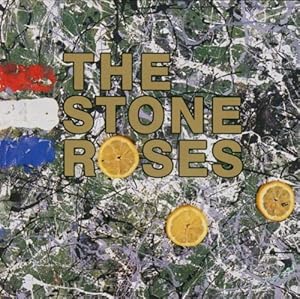
This album boasts incredibly abstract features that are appealing and easy on the eye. The art is actually a product of John Squire's (Stone Roses lead guitarist) painting, the abstract backdrop in conjunction with the bold gold typography embosses the bands name to ensure it is clear and visible. Squire's piece has been heavily influenced by Jackson Pollock's artwork - a painter who was pivotal in the abstract expressionist movement - essentially it connotes that the band are not looking to represent external reality, but they are manifesting subliminal messages through abstract work that can be interpreted in a number of different ways - by fans buying the album, they are giving their artwork their own meaning. The French flag on the far left side of the album pays homage to the May 1968 riots in Paris, where the use of lemons where found to be a viable antidote to tear gas. The fact that the band would choose to reference such an event to support the release of the album is in itself a demonstration of the bands contribution to the rock/indie subculture: the majority of bands were still fixated on covers boasting self-portraits of the band/artist posing in dignity or photos of the band in peculiar situations. At first glance, the albums backdrop can easily be mistaken for an image of a map or a birds eye photograph of a western european country, which makes sense considering the ideologies and inspirations for the album. The typography is specifically designed to attract attention, it is a no-nonsense bold lettering makes the band's name (essentially their brand/identity) unmistakable. Not only is the typography appropriate, but the use of gold lettering contrasts the background well - making the text stand out - but gold is also an incredibly prestigious that connotes wisdom, magic and passion, whilst the metal gold is an incredibly lavish commodity.

 The abstract nature of the painting compels the consumer, forcing them to further analyse and ponder the albums imagery. The cover is thought provoking, which encourages the consumer to pick the album up and contemplate buying it without even giving thought to what is undisputably the feature of most importance in an album - the music. The album highlights just how important an identity is to a band, and also the significance an album cover bears on how many copies it sells, an album cover design should not be underestimated as it is one of the single most efficient methods of marketing the product.

Sunday, 12 October 2014

Mind-map: Initial Ideas and Perceptions

In order to help me collate ideas for my music video, I have created a mind-map that documents all my initial ideas and perceptions of how the video should be composed - this will help me in my planning stage and it will also allow me to then produce more ideas for a storyboard and therefore my animatic before I eventually start filming. These are my initial ideas and perceptions:


This mind map has allowed me to collate my thoughts and ideas of how I initially foresee the video in my head, despite having a number of ideas I have based this mind map on the idea that I will be using my younger sister in a video that is similar to that featuring lonely, isolated and vulnerable protagonists i.e. "The A Team" - Ed Sheeran.

Thursday, 2 October 2014

Textual Analysis: Dire Straits - "Money for Nothing"

Camera

The video uses a number of close ups on the fictitious characters as well as the actual band members to capture emotions throughout the performance, encouraging the audience to empathize with the artist. Close ups are used as well as long/two shots to capture the band on stage in one shot together - as the video is a performance video.

Mise en Scene

In the real life shots, the band sport clothes applicable to 80's fashion: headbands were worn - a trademark of Dire Straits who essentially formed a subculture through their music and fashion. The instruments used are also appealing colours to maintain the interest of the audience: lavish guitars are used to look fancy and give the band a respectable image. All aspects of the Mise en Scene are relevant to the social historical context of the time period in which the video was made - fashion such as wristbands and flamboyant shirts are made more visible by the neon lighting effects used in the video to enunciate the bands identity and image - they are essentially a brand.

Sound

The soundtrack used is the original recording of Dire Straits' Money for Nothing. The video has been tailor made to accommodate the sound of the single in order for the text to transition smoothly and in synchrony.

Editing

Many quick, concise cuts are used to shift attention quickly and encourage the audience to invest interest in the video, which uses bright colours due to the vibrant animations. Many tracking shots are used to maintain focus on the band, which emphasises importance and forces the audience to concentrate on the ideas/emotions the director is trying to put accross. Neon lighting effects have been used in the shots where the band are performing (neon effects have been omitted from the computer animated segments of the video) to highlight important features such as headbands, wristbands, guitars and even their shirts - these bright accessories/instruments with undertones of eighties fashion present a clear image of the band to the audience. At the time, some form of high tech video editing software would have been utilised in order to add digital effects to the video, almost like a latter day iMovie.

This video was considered ground breaking at the time of it's release, MTV were persistent in their desire to produce an animated promo for the track, as they felt they were broadcasting too many performance videos of artists standing there and playing instruments - they wanted something cutting-edge that would break the conventions of music videos and surprise people.

Music Videos - A Comprehensive Historical Overview

History

In 1927 the inaugural sound film The Jazz Singer was screened across the USA and was heralded for it's innovation - combining two forms of media that were not previously associated with one another. As a result of it's commercial success, the film was somewhat of a catalyst in the decline of the silent film industry - which deteriorated soon after the release of Alan Crosland's feature.

It was in the 1930's that the first 'soundies' - three minute films comprising of music/soundtrack and short dance sequences - were produced in New York, Chicago and Hollywood. They were screened on visual jukeboxes - the Panoram to be specific - in bars, nightclubs, restaurants and amusement centers. The Panoram therefore served as a viable means of marketing the product as consumers found themselves surrounded by a platform on which they could watch the videos, rather than having to go and 'chase' music videos. The Panoram was a coin operated jukebox system, and with ample Panorams scattered around New York, Chicago and Hollywood, producers found that this system of marketing could prove lucrative.

Throughout the late 1930s and 1940s, Metro-Goldwyn-Mayer (MGM) enjoyed it's most fruitful spell of musical productions, most notably The Wizard of Oz (1939) and Broadway Melody of 1940 (1940). After the success of the latter films, MGM realised that music and video were a successful convergence and began producing an array of musicals in what has been described as their 'Golden Era'.

1963 saw the appearance of the UK's first TV programme: Ready Steady Go!, which was broadcast live from ITV. The show would stage mainly rock bands with choreography and make-up kept to a minimum to make audiences feel closer to the action, promoting consumer involvement. Performers where scattered amongst many small stages so that transitions were smooth and kept the viewers engaged - similar to the format in which Later Live With Jools Holland is now presented. The studio was quite confined and limited, however the production team stated this is actually what they wanted, as it allowed people watching at home to be able to feel a sense of involvement and facilitated camera work to capture the bands from a number of different angles.

Just as Ready Steady Go! was gaining popularity, it was rivaled when BBC began to air Top of the Pops (TOTP) in 1964. Essentially, TOTP was a 'performance video' of bands performing hits popular that week, although they were actually performed live, some bands have used footage of themselves performing on TOTP for performance music videos.

By 1967, The Beatles had released promos for Penny Lane and Strawberry Fields Forever. This form of music video was referred to as a 'promo' - which engulfs it in connotations that suggest the video was to help market/advertise the record. The promo for Strawberry Fields Forever has been cited as an innovation in the music video industry and that what was in the 60's classed as a promo is now widely accepted as a music video.

Queen released the soundtrack and promotional video for Bohemian Rhapsody (directed by Bruce Gowers) at a time when the incremental success of music videos was rapidly increasing in 1975. It was noted that by releasing a promotional video for a record, it meant television companies could broadcast the video and have the song played on their channel without having to have the artist present and boredom was not a problem for the audience. This idea formed the basis of MTV and all the other music channels that followed. It is widely regarded as the first promo that is now

1981 saw the inauguration of MTV, which is when various artists saw the lucrative benefits of producing music videos as they could screen the videos without having to be present in a studio, yet the artists/record companies received royalties - record companies began to exploit the financial rewards of MTV.

Michael Jackson's Thriller made music video history due to the effects and vibrant display. It sustained a captivating narrative - almost a hybrid of a thriller (hence the title) and a horror wrapped into a music video. Released in 1983, MTV was already incredibly popular, meaning Thriller received plenty of air time.

1984 saw MTV's official music video awards launched, encapsulating just how important video convergence is to the industry, a song could be mediocre however if the video was deemed interesting my the public, a promo alone could win an artist an honour.

At the time of it's release (1986), Dire Straits' Money for Nothing music video was considered not only an innovation in the music video industry, but ground breaking. It utilised advanced computer animation software that illustrated the bands lyrics, this alone placed it top of the charts and also top of the music video charts for it's compelling narrative features.