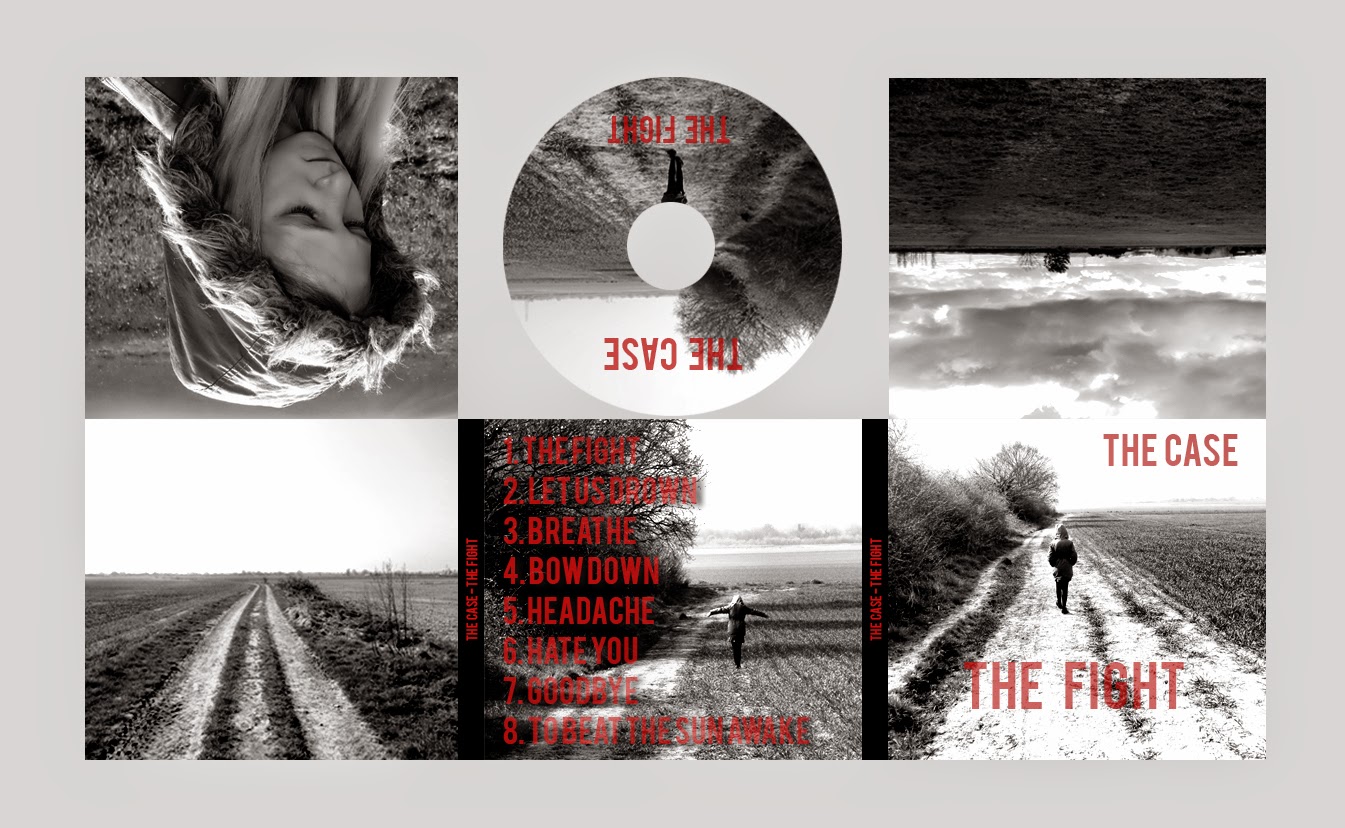
As recommended by my teacher during feedback, I have adapted the levels in the photos to make the images more black and white through adapting the chiaroscuro elements of the image to give it that 'indie/rock' edge. The effect of the black and white shades rather than the more dull/vague grey colour is that it subsequently makes the red typography far more striking and visible to see - however, my teacher did point out that the opacity of the typography on the anterior panel, posterior panel, spines and CD itself needed to be reduced to make the typography far more striking and clearer against the back ground. It is clear that on the anterior panel (front cover) that the text ("The Fight") appears quite faint as it is against a very white background - this is a change I will have to implement for my final draft of the product.
Overall, the digipak is essentially finished as my ability using the editing software (Photoshop CS3) has developed significantly throughout the production process, whereas I made the images more of a grey in the previous draft of the digipak, I discovered that by selecting Menu > Layer > New Adjustment Layer > Black and White I could achieve the effect that I wanted to achieve. Following this, I would then select Levels > Chiaroscuro and tweak the sliders to get the black and white monochrome effect I have set out to achieve since the inaugural stages of my planning. My ability to use the editing software has begun to burgeon recently, which has directly affected the way in which I am able to either adhere or subvert conventions which will effect the way in which my product is perceived.

Depicted above is the second draft of my digipak, and this displays the significant changes my product has gone through over the course of the production process - notice the more dull grey tone to this digipak - the text appears less striking against it and the colour contrast between the light and dark shades is far less pronounced - compare the top left hand panel of each digipak and the difference is clear, the light reflected of the coat is bright whilst shadowed areas appear far more dark i.e. the inside of the hood and certain strands of fur round the periphery of the hood. On the other hand, in the digipak depicted above, the image in the top left hand panel appears as one very bland, insipid shade of grey. Also noticeable is the difference in typography between the two products: the second draft uses a far less suitable typography: it seems very basic and quite unsophisticated, almost like a comic sans type of font which is not suitable for a rock band.
Despite the changes I have made to the digipak, my teacher has advised that I adjust the opacity of the typography in my final edit - he told me that is does not make as much of an impact and that the text would appear far more striking against the monochrome background - he informed me that this is the only change required to get my product to a high level.
No comments:
Post a Comment